

ParkGo Case Study - Hongkong
My Role
UX analysis ( User flows and Sitemap)
UI Design (App Interface)
Prototyping (Flow and interactions)
Tools
Sketch
Principle
Illustrator
Photoshop
Rhinoceros
Project Goal
Make a credible platform that would allows users to complete their task easy and fast
Create good user experience that suits with locals’ needs and expectation
Problem Scrope
Problem and Context
Just like a housing issue, nowadays Hongkong people have suffered from a shortage of parking spaces. The parking fee can also be ridiculously high due to the huge demand for that. ParkGo offers a solution to this problem by connecting people with shopping receipts that could be used to reduce parking fee with those who need a parking space. So instead of throwing them away for nothing they can used it to make a small income while car owners also get discount benefits from that. It’s Win-Win situation for both of them.
Challenges
When the client first came to me with the concept I was very excited with the challenges of this project. I lived in Hongkong for a year earlier however the information that I have for the application is definitely not enough. I wouldn’t be able to conduct interviews or do much research myself. This project I required some helps from my client side when it comes to research process. Therefore, all researches were done by them. I gathered all findings and analysed them together with my client team. Then, I participated in generating information architecture with them remotely.
Come up with the best possible way to answer user needs and solve the existing problem
Gain deep understandings and insights from potential users from aboard.
International collaboration
Insights
Here’s information that I visualised from the data from the client team:

Discovery
Task Flow


I wanted to deliver a better user experience to users by letting them accomplish their goals within the app in the faster and easier way. To do this, I started by creating task flow for specific use cases to understand the ways a user might go through when they use the application.
SOLUTIONS
Receive sufficient research findings which are vital for the design decision
Save time and Reduce frustration by making it’s easy for users complete each task in few steps
Keep the interaction between users at low
Create win-win situation for both users, while one gets a discount for parking fee another get a side income from a receipt that they usually just throw away.
Allow users to match their offer/ request by themselves without the need to wait for the system to do so
Provide each user security and privacy by eliminating the chatroom and user detail right after the process is done.
Chatroom will be eliminated right after the process is completed to stop the further interaction with other users.
DELIVERY
Design

Offer & Request in few simple steps

A process begins with choosing a location, making an offer or request, matching and navigating to another user. Then, follows by making/ receiving a payment to complete this.
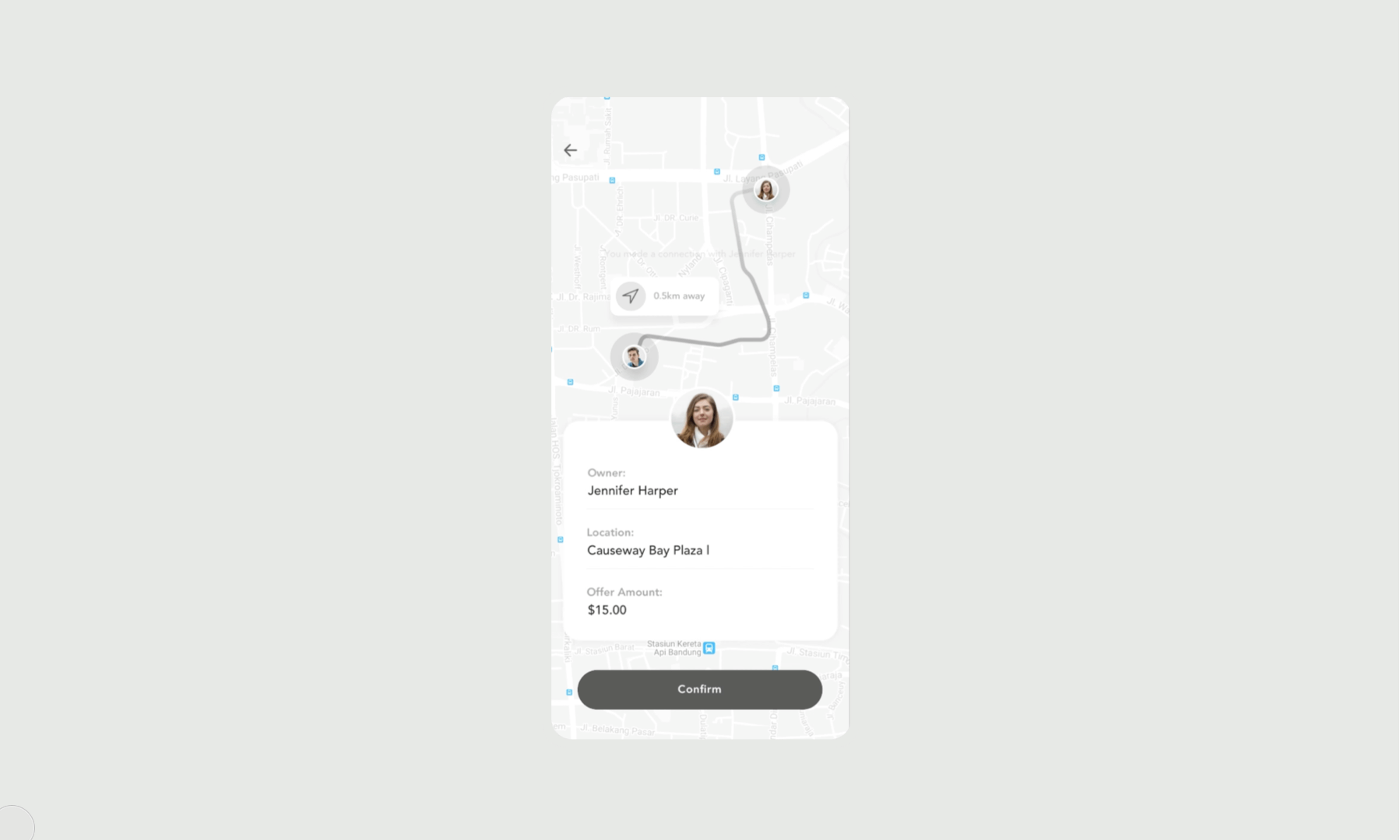
In-app Navigation

An application provides a built-in navigation feature which shows a location of both users at the moment and also guides them to meet one another.
On-going Order

The app offers few ways for users to complete a task either by a system or themselves from an on-going feature. This will show all requests/offers that are happening in the chosen area, which allows them to match with another user without the need to wait for the system to do it.
One-Click Card Payment

The majority of Hongkong people usually pay with Credit card. Therefore, once the exchange step is done a user can pay with saved credit cards from a previous transaction with just one click.
One Time Chatroom
Hongkong people value their privacy and security a lot. Therefore, they don’t want any further interactions or let the others have their contact details once the process is completed. Therefore, a chatroom will be created only when they match and eliminated when the action is done.
Colors

The grey-green was chosen to be used in the application. Firstly, from the client preference but then according to the color psychology, green is great when it comes to transactional activity as well.
Typography

Avenir is chosen to be used in the application due to its geometric, clean and modern look. In term of colours, most text are in black and I created a hierarchy by reducing opacity of texts that are less important. Black and yellow looks standout on each other due to the strong contrast they both are.