Point of service
Product Designer, Nov 2021 - Aug 2022
Context
VanMoof is a global company with people united by one goal: to help you get around your city faster, smarter, happier, and in the utmost style. VanMoof has repeatedly shaken up the international bike industry with rapid innovations and unconventional solutions.
As the company grows, the amount of customer bikes increases rapidly as well. Repair is the key service to keep the after-sale customer satisfaction high. With the amount of internal tools, the repair process becomes both time consuming and complex for our internal users. This results in customer dissatisfaction.
Therefore, our design question was:
Roles and responsibilities
Project planning & vision together with the stakeholders
led the design and collaborated with other stakeholders throughout the entire process
Conducted user research, interview, validation and testings
Created requirements, user flow and journey
Creating a UI design system, detailing the components and reviewing implementation.
Continued with the improvement and development based on user feedback after the release (The feature was launched partially to some stores in the Netherlands in beginning as a pilot in June 2022 and globally in December 2022).
Process
I followed the User Centered Design process to investigate how I could improve the current repair experience based on user and business needs and problems. I let the user research be the guide, brainstormed with other stakeholders and designed multiple solutions. Then I tested ideas with usability tests and developed the final design based on the findings. I also keep my eyes on after launch feedback from our global users and come back for some iterations to make sure we deliver the best experience for our users.
Picking up the pieces
User Research
Letting user research be our guide, I followed the User Centered Design process to understand business and user requirements. I started from many stakeholder interviews to understand the needs from both sides. Next is to understand our users’ problems by talking and also shadowing while they’re working to understand the entire experience.
Filed observation, shadowing uses and user interviews
We also conducted a workshop with store managers from around the world to make sure we capture every step of their roles in a customer journey map. I combined the insight and defined the problem and brainstormed with the team. We created the user journey map for both users based on the rider journey to understand what are their roles in the journey, what do they need in order to support our customers and how can we provide the best experience for them with POS.
Retail user journey in the repair process
The entire process of repair with all the tools
This retail experience map is based on a customer journey with the bike since the discoverability. This helps us understand the steps they take in the process.
Early Insights from the Field
Rely on many different tools
I learned that users need to use so many internal tools in order to support the repair process. They have to start from one tool, move on to another and finish with a different one. The tools are also complicated to use, not reliable and the information is hard to find. The new retail staff also don't feel confident with the tools, often struggle to use them and it takes time for them to perform the action.
Lack of transparency
Due to the use of many tools and a huge amount of manual work for the entire process, it is almost impossible for users to keep track with the progress and so does a customer. Once the bike is sent to repair, they can no longer keep track of what’s going on until it’s done and ready to be picked up. It’s frustrating for users that they can’t answer customers’ questions or give any updates about their repair status.
No information at hands
In order to fill in all the details by themselves, especially crucial information like customer details, frame number, warranty and POM. Users need to go through many systems to get this information. It consumes a lot of time to complete the process. In the real working context, it’s extremely stressful to do this while there are plenty or angry customers waiting in the queue waiting to drop off their bikes.They sometimes feel inhuman to deal with this everyday.
Lot of manual works
The progress relies heavily on manual labor work. Users need to fill and complete each step in the process all by themselves. This goes over and over again, day by day and can lead to higher risk of human-caused errors.
Design Goals
Design question was that “How might we make POS smoothen and fasten the entire repair process”
POS should become a one stop service for this. Where a user can stop relying on other tools and utilize the system to work smarter and more efficiently. This will not only smoothen and fasten the process but provide more transparency through the entire repair experience.
Three major UX problems to tackle
Based on the research, the first problem is too many tools required in the process. Because POS doesn’t provide all the features users need for the entire repair journey. It makes the entire process longer and hard to keep track of. Besides, there's a higher chance of making mistakes when relying on too many tools, especially with manual work. I need to find a way to provide all the necessary features and reduce the manual steps for the entire repair journey in POS.
Another problem is the lack of transparency, users don’t have enough information to give to customers when needed. As a store supervisor, I must be capable of providing important information to customers. I need to provide users with all the information at any stage within POS and everything needs to be transparent.
Lastly, not making use of the system as we should. There are potential and possibilities on ways to utilize our system smarter. Users need to do a lot of manual work to complete the action. The system also doesn’t provide the information when they need it even if it’s available in the system. I need to explore and use the system in a smarter way to assist users with information when needed and reduce the amount of manual work as much as possible.
Design Solutions
Here are the findings and solutions to each stage:
Repair creation
Instead of using a planning tool or My Vanmoof to create a repair for customers this feature must be available in POS. The requirements aren’t only to take what we have in those platforms but improve the process as well.
Key Finding #1: Lot of manual steps and missing information
During our field observation and user shadowing session, we found that the repair creation process requires a lot of information in each step. In order to get those, they need to go to different tools to acquire them. They have to ask for customer details & frame number and check for a repair history every time and most customers can’t provide all of the information. This information is essential to complete the action, which is why retail people need to search and fill everything manually by themselves.
This isn’t only time consuming but this often Leads to Higher Risk of Human-caused Errors
Solution:
Why ask users to fill in data where a system can? The solution is to utilize the system more. Starting from the easy simple thing like a customer name where he/she can always provide. Then retrieving data and letting each system communicate with one another, we can get the frame number, repair history and customer detail in a few clicks without the need to ask customers or search by themselves.
With these we can reduce the amount of manual work and steps to complete the process. They also no longer need to go to other tools to get the information. This will make the repair creation process way quicker and easier for the retail team.
Check in the bike
Then the next important step after repair creation is the check in. Customers come to the store to drop their bike, instead of using a Planning tool this should also be available in POS.
Key Finding #2: Missing the key information
Different from the repair creation, the key information to complete the process here is the bike's warranty and POM status. They usually struggle to find these because there’s no information available in POS and it’s the key to determine the repair cost. To get this information, they need to search from different tools and have to manually fill in all the details by themselves.
Solution: Drop off and check in the bike ( Appointment page)
With the provided frame number in the repair creation step, users no longer need to ask or search for warranty &POM status.This can be retrieved from the system earlier in the repair creation stage and displayed when a customer comes to drop off their bikes.This not only saves time for them but reduces errors and helps them make important decisions.
Key Finding #2: Not just checking in the bike but floor management
For a store (assistance) manager, it’s not only about the drop off process but the floor management for the retail team. At first, I didn’t know that they use this to plan their day and manage other tasks during the day. In the first release we didn’t implement these features and unsurprisingly users went back to use another tool instead of what we provided for them.
Solution:
After learning from the usability testing session that we solve one problem and create another for our users, we change the format of the appointment page to serve our users better. With the new time format a user can simply see how many customers they should expect in each time slot and how many staff need to be at the front desk during that time. We include the filter to show the available slot for the quicker way to see the overall availability and also include the insight for the long-term planning for a store manager.
Pickup and checkout (repair page)
Key Finding #1:Lack of transparency during the process
Once the bike is checked in to the system, there’s no way for the retail team or customers to know what’s going on. Also the service and problems that the bike doctor found and added during the repair process aren’t that clear either. Sometimes they put these details in one place and sometimes another. So it’s a bit hard to keep track of these for the retail team while customers are totally lost.
Solution: Every single step of the bike repair can be checked and tracked starting from when the appointment has been created. The users now can see all the services and things that have been applied during the repair process. With this, now they can answer all customers’ questions, provide details and explain the repair summary to customers.
Key Finding #2: Editability
Some customers come with the same repetitive issues, which could be a bike itself or repair process issues. They are usually angry and demand for discounts for the repair. The mistakes could also be made by a bike doctor during the repair process about the service and repair price. This is almost impossible to change once the bike has been moved to ready to pick up state. In order to change this they have to create another repair to replace this one. This is time consuming.
Solution: Allow retail to edit the details by Providing the price changing feature in the repair detail page. If a retail person notices that a problem has persisted for a while and it’s not because a customer inflicted damage to the bike himself then he can apply discounts on the bike for the customer. This would help to reduce the conflicts with customers. When the mistake has been made to the repair ticket then this can easily be changed either to add or to remove.
Early Discovery
Customer insights
These are the key insights that defined the launch the latest version of the product:
OPPORTUNITIES
.
Not just Chama order
Resellers are only able to manage Chama orders within the Partner Portal. However, they also rely heavily on orders outside of our platform. This stops it from being a one-stop-shop tool for them.
.
Full visibility of drivers
and delivery process
The tracking page only provides a map showing driver pins, resellers have no insights about drivers’ statuses and their ongoing orders. Only drivers who have registered in our Partner Portal and use the Driver app are shown on this page.
.
Better store management
To manage each store or service area, resellers need to go to the left navigation to select the one that they want then go to the product and coverage page to change the details. The process is unnecessarily lengthy and very time consuming.
.
Making a report easier
A report is a key part of the business. Resellers do this either daily, weekly or monthly. They need to scroll through the small concluded order column to collect the data which takes a lot of time and effort.
.
success rate could be higher
Our users are not tech savvy and struggle using our tools and features. For drivers this is most apparent, as it hinders their order process to be completed.
the New Partner Portal & Driver app
1. Design System
Before going over the new features it’s important to mention the new design system which is at the heart of our products. We used to have a library for each product which made it difficult to maintain consistency. These libraries had some legibility issues due to the low recognition of text which was influenced by the type size and contrast.
This key idea of the design system is to have small and independent parts which can be combined into larger molecular structures. Together it defines our design patterns including typography, colours, icons, spacing, navigation and information architecture across all three applications. Not only does this help guide designers maintain brand alignment, it also makes the implementation process easier for the development team thanks to the modular nature of the design system.
2. Introducing phone orders
The Partner Portal now allows resellers to add orders received from outside of Chama’s tools into the system. This enables resellers to track and manage all of their orders in our tools, making our Partner Portal a true one-stop-shop tool for resellers.
3. Full visibility of driver and delivery process
In order to have the full visibility of all drivers and delivery processes it’s crucial to not only improve the Tracking page feature but to have all drivers on both platforms; Partner Portal and Driver app. We used the following approaches to accomplish this goal:
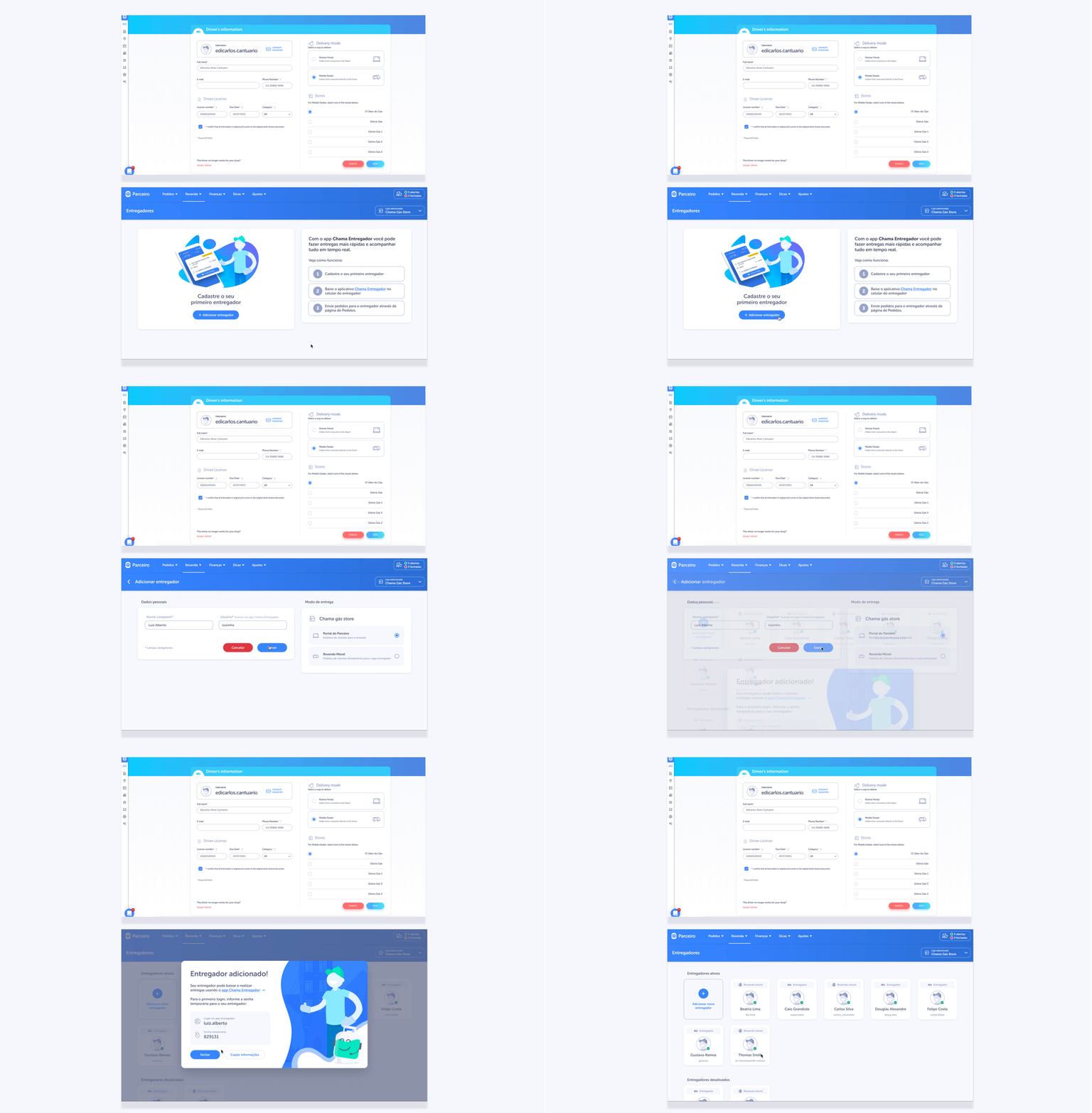
3.1 MAKING DRIVER REGISTRATION MUCH EASIER
We simplified the registration process by removing confusing and redundant fields and instead asked resellers to only provide the necessary information of new drivers. This simple change significantly sped up and lowered the bar for registration.
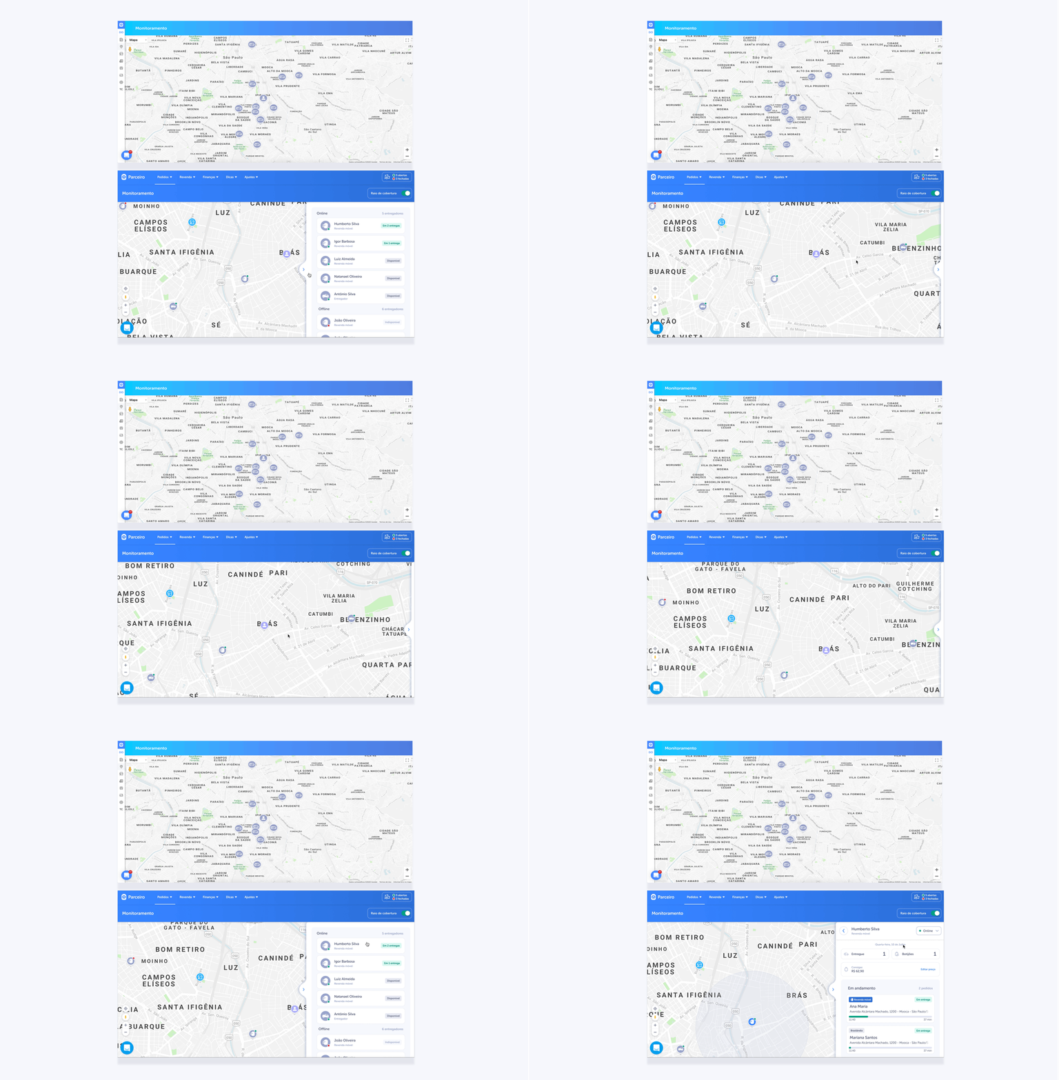
3.2 Brand new tracking page
We provided a driver list panel as a default state of the page. Resellers can either search for a driver on a map or choose one right from the panel. This gives them all necessary information about a driver. Moreover, they now can manage their driver’s product, ongoing orders and online/offline status from here.
4. Order history page
It has been difficult for our resellers to generate reports using the old Partner Portal, to combat this problem we have added an order history page that can be accessed from the order page or separately via the menu. This page provides filters, search tools and a date picker to make the searching experience quick and easy and allows users to save their results as an Excel file.
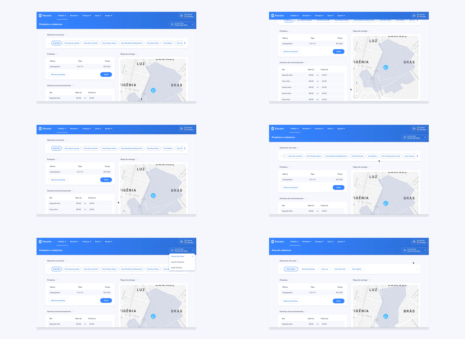
5. Multiple ways to manage stores
Store and service area management is the feature resellers use at least 10 times per day everyday to manage the product and opening hours. We have moved all the service areas to be in a single page together with product, price and opening hours. This way they can manage everything faster and easier while having a store selector always visible on the top navigation bar.
6. Increase the success rate
6.1 Communication is key
We use a popup dialog to inform resellers every time we launch new features when they log into the Portal. Moreover, with the use of Intercom articles, they can learn more about how to use these new features at any time.
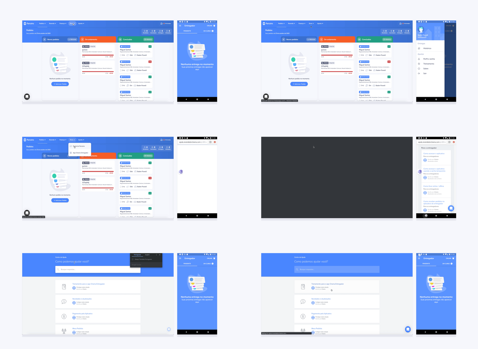
6.2 Educate our users
Ease of learning is one of the most important things for users. We know that most drivers aren’t tech savvy and often have problems using smart devices. Therefore, we provide Training materials that explain everything that they need to know in order to use our app and ones for resellers as well. This material can be accessed at any time from both tools.
6.3 Guide when the problems occur
Most of the time when issues occur, drivers don’t know what to do and this interrupts the whole delivery process. We provide the Troubleshoot feature with a step by step guide to help them solve the issue in the easiest and fastest way possible.
The Impact
Positive results and STILL ON GOING
The new design of Partner Portal and Driver app had a positive impact on the whole logistic process, success rate and order volume. However, there are still many voids and opportunity to bring this to another level. I believe this to be an evolutional change that will change the behaviour of the market over a longer period of time. Over a year we have changed these (for confidentiality reasons I have omitted the actual values for these metrics)
Average delivery time decreased by 41%
Success rate increased up TO 90-100%
ORDER VOLUME INCREASE by 72%
a number of user (reseller) increased by 93%
a number of user (Driver) increased by 560%


