

Charge Design System
Lead Project Product Designer, Aug 2022 - Feb 2023
Before I joined Vanmoof, there was no design system for the company's digital products. There were few libraries in use but it’s hard to maintain and keep things consistent when we do have so many products on many different devices. At first glance, it’s clear that there were significant design inconsistencies among them. There’s no single source of truth for designers and developers. The goal is to improve the product design and development process, provide a harmonious experience for our users, manifest design principles and make the collaboration between designers and developers more efficient.
My role
Project planning and governance process
Market research, inventory audit, stakeholder interview and component testing
Cross collaboration with all product teams
Create, maintain and document the Design Language System
Bi-weekly presentation to keep everyone up to date with the progress
UIKits implementation review
Design System Governance Process
The project stages we went through to create the design language system:
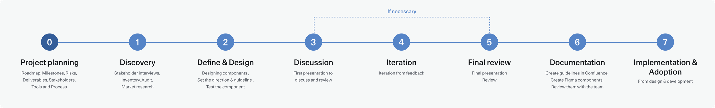
Project planning
I partnered with the Head of Experience Design to plan the project roadmap, define milestones, assess risks, and outline deliverables. Together, we identified stakeholders, selected tools for documentation, progress tracking, and component reviews.
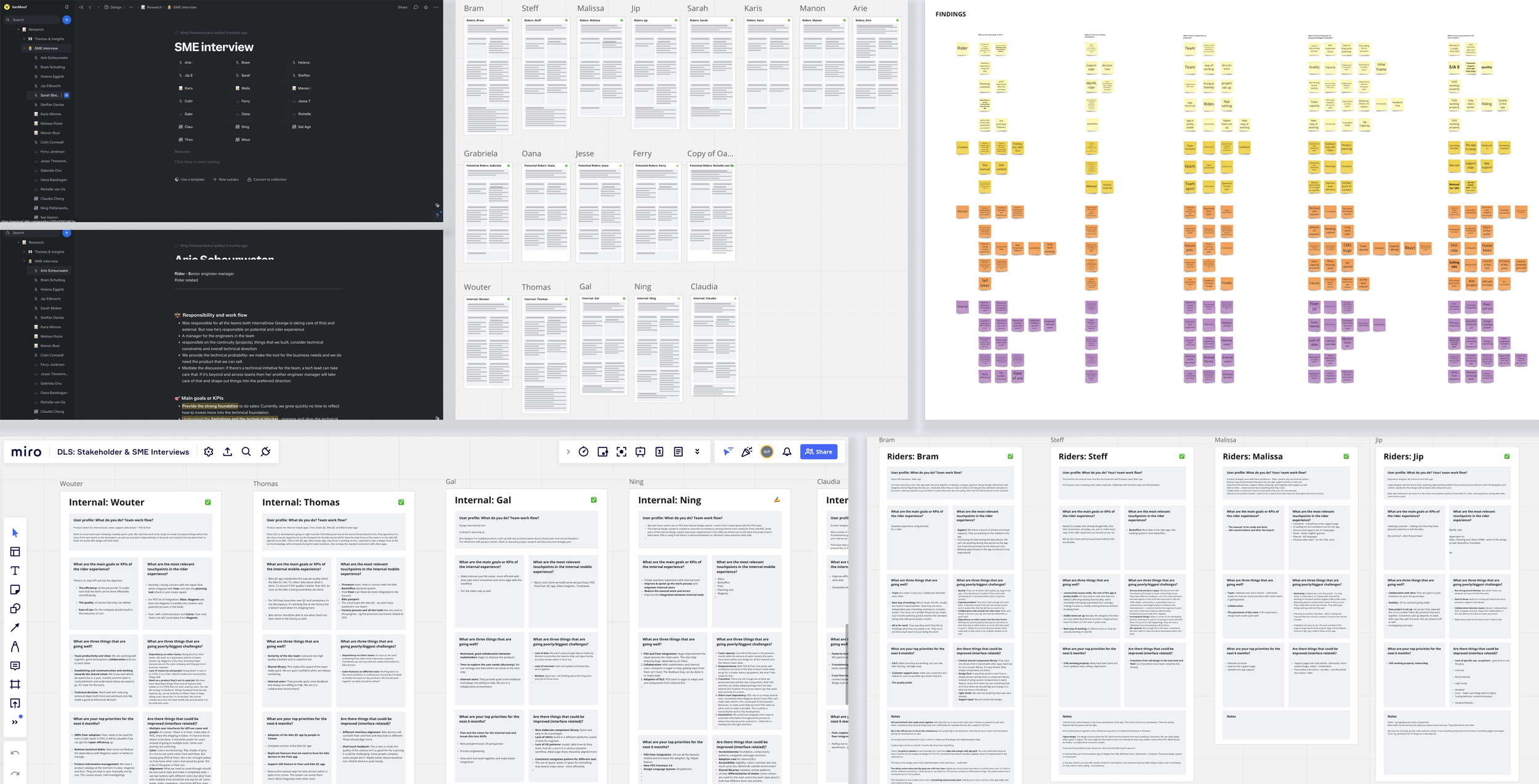
I conducted SME interviews with all stakeholders to understand their products, pain points, requirements, and goals. We established a governance process, refined it through feedback, and ensured it worked across all teams. Once the tools were in place, I created design backlogs aligned with the roadmap.
For content, I collaborated closely with the content strategist and UX writer to define the structure and guidelines for our Design Language System.
Discovery
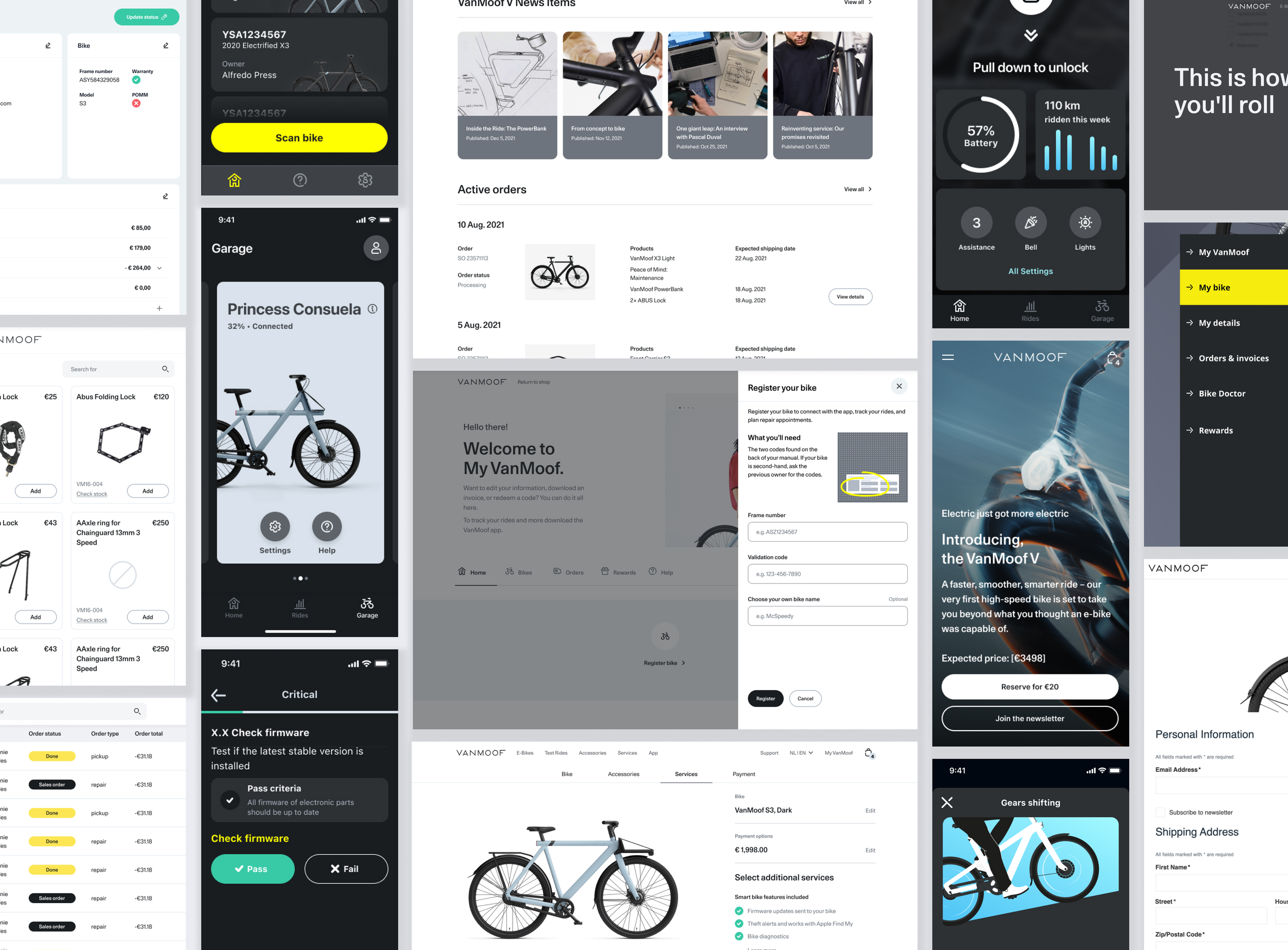
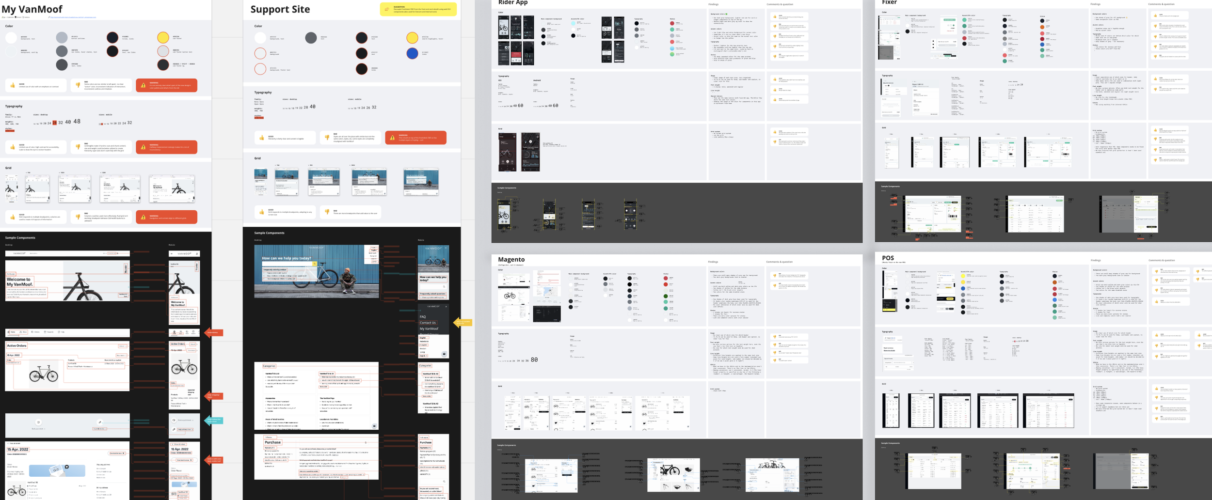
Working from the backlog, I applied the atomic design methodology, starting with foundational elements before progressing to full components. Each component began with an audit, which revealed numerous inconsistencies across our products. To address this, I interviewed designers and developers from different product teams to understand current usage patterns and challenges. I also conducted market research, exploring how other companies structure their design systems and identifying best practices and conventions we could adopt.
Define & Design
After the discovery phase, I had a clear view of the existing patterns, pain points, and areas for improvement. I collaborated closely with developers to understand technical constraints and identify best practices for implementation across all tools. This ensured that each component was designed with both usability and technical feasibility in mind, setting a clear direction for the system.
Review Process
We held bi-weekly review sessions with the entire team, where I walked through design decisions and gathered input to ensure alignment across products. Decisions were made collaboratively, and each step was documented. Components were iterated based on feedback, followed by separate review sessions with each product team to validate all use cases. After final minor adjustments, I moved the designs into documentation. Any items not reflected in the final version were logged in Jira for future review.
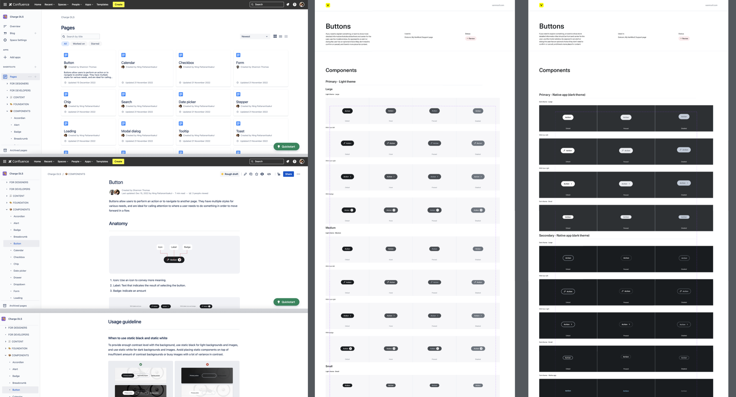
Documentation
Once the design patterns were finalized, I created the Figma components, documented the guidelines in Confluence, and conducted a final review with stakeholders to ensure alignment before rollout.
Implementation & Adoption
In the final stage, I worked closely with product owners and developers across teams to integrate the design system into each sprint, tracking progress for both design and development in Jira. This provided full visibility into the implementation status for every product team. Since adoption varied by team, maintaining transparency and clear communication with stakeholders was crucial to ensure the new patterns were eventually rolled out across all products.
Guideline & Execution
We can’t create a design system without a good foundation. After concluding everything, I started with the foundation and guidelines of the design system that would be applicable to all tools. Other designers can use these guidelines to create new components and expand the system further. The foundation elements of our design systems are grid, spacing, colour palette, typography, and iconography.
Foundation
Responsive layout grid
So the first step was to set the spacing and grid.
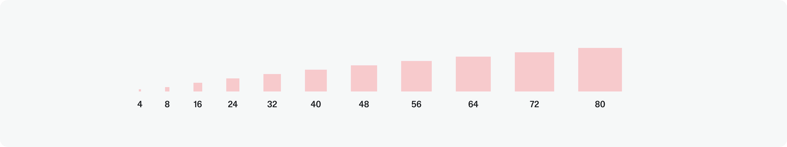
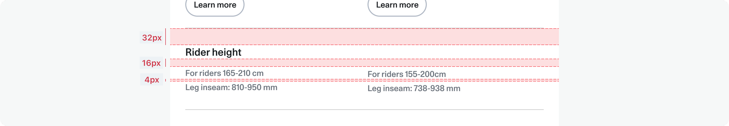
4px grid
Use multiples of 8px when defining measurements, spacing, and positioning elements. When necessary, We use 4px to provide more fine-tuned adjustments.
For the web, we use two main grid structures: one with left-side navigation for internal tools and one without for customer-facing sites. Both follow a 4 pt grid system with 12 columns and a 4 px baseline grid.
The column widths differ; one uses percentages, the other fixed values—to maintain responsiveness. Gutters are always 16px. In the internal grid, the menu has a fixed width while the design area adapts to screen size, calculated as screen width – menu width.
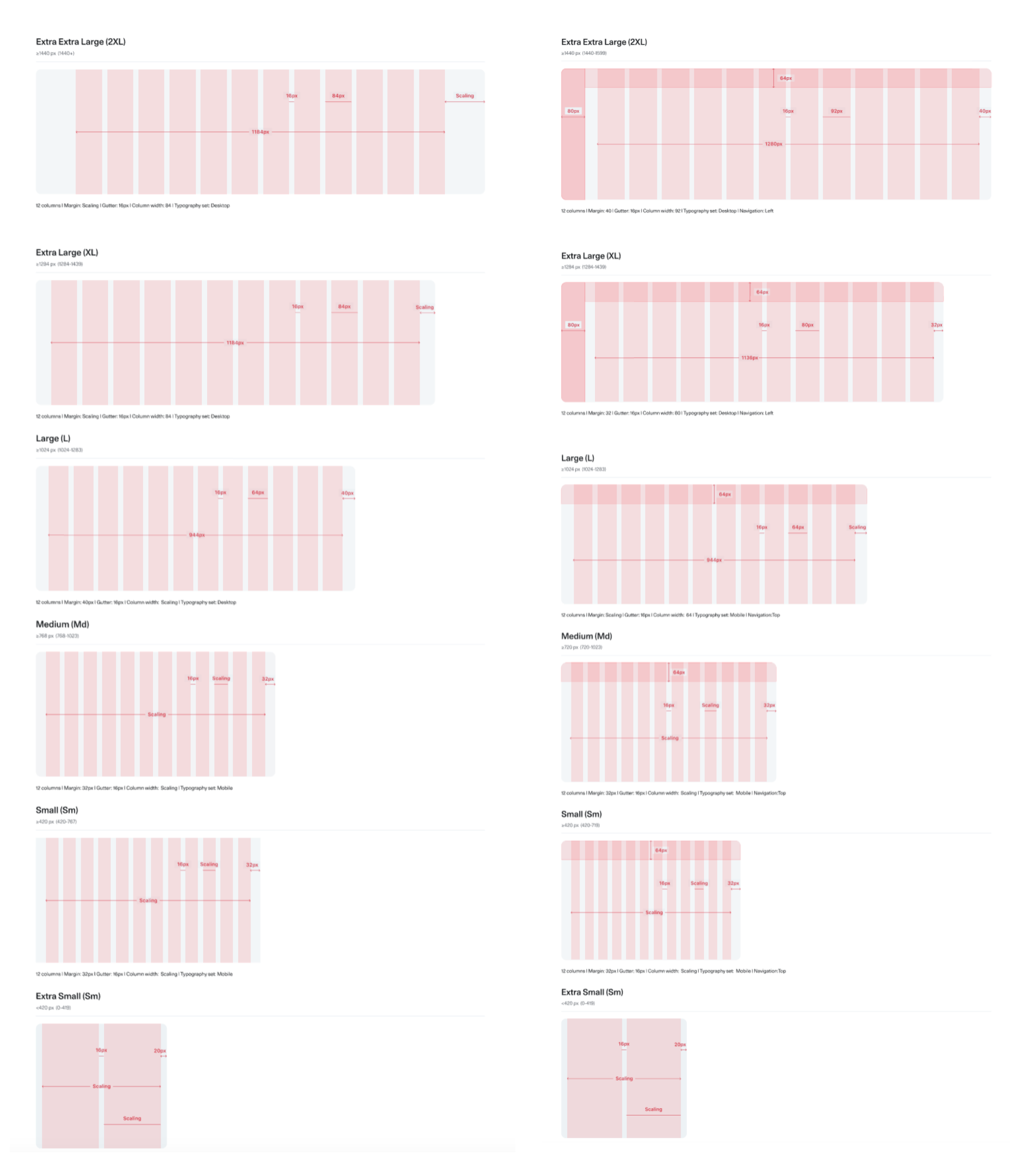
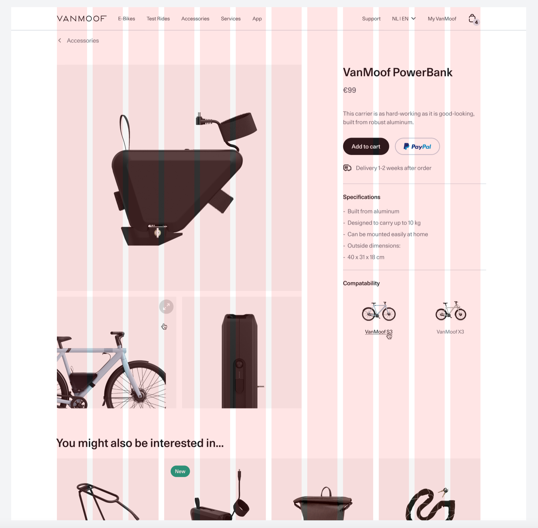
External (customer-facing web)
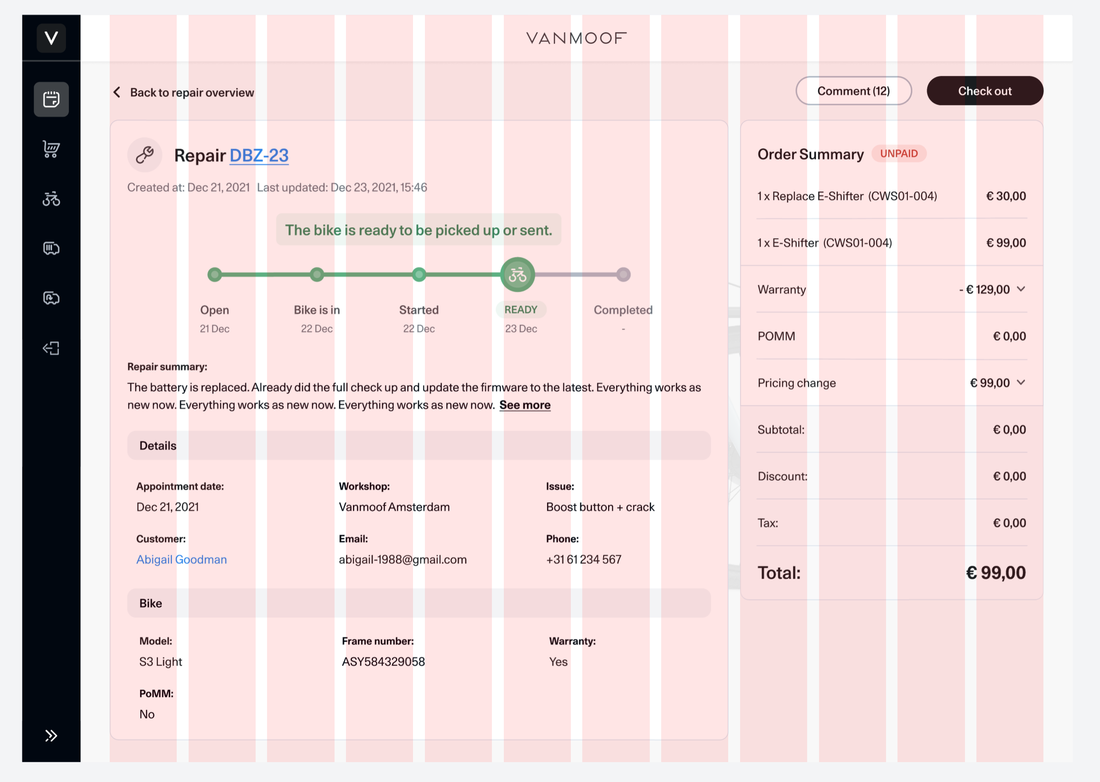
Internal (Left side navigation)
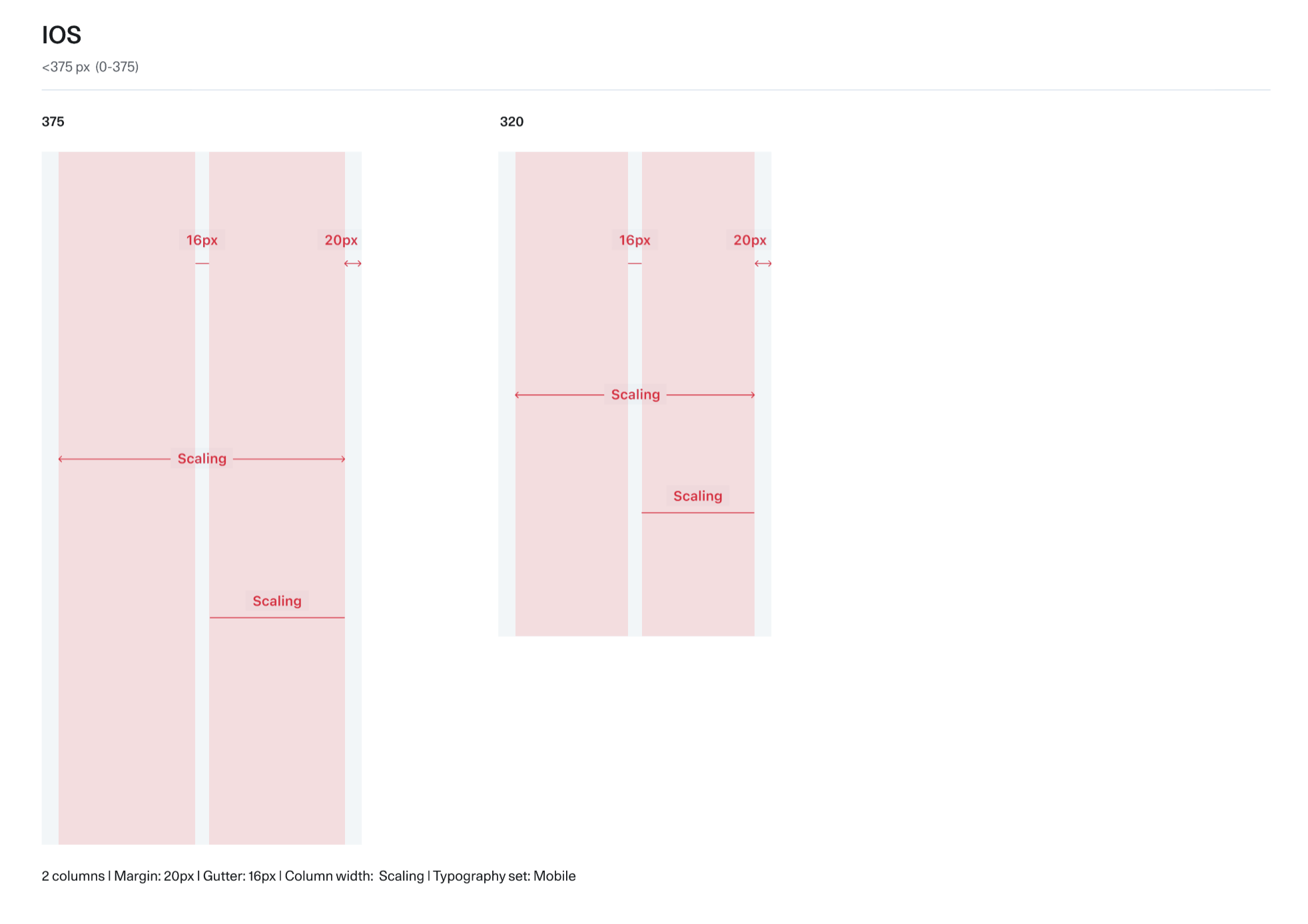
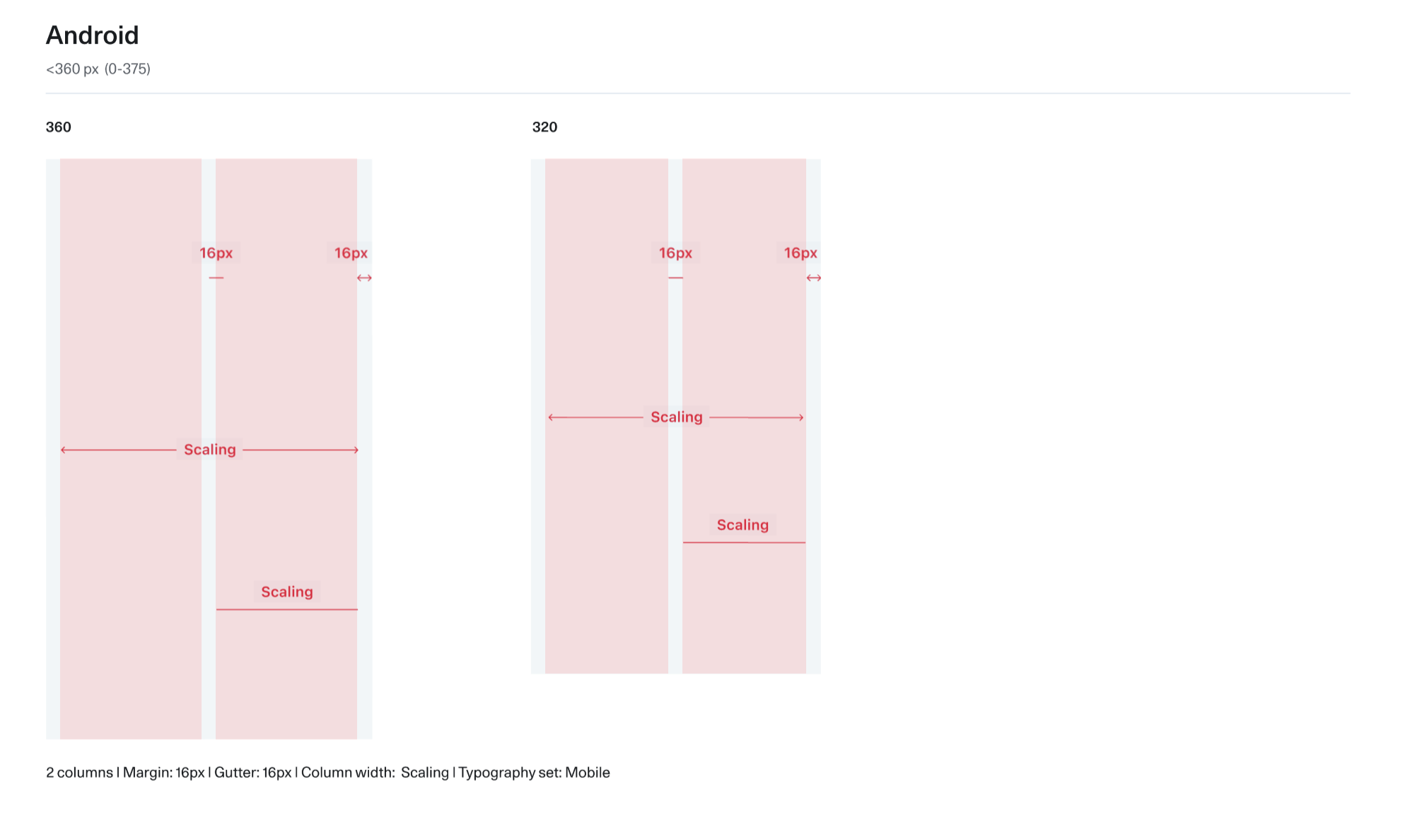
Native app
For the native app, we have 2 grids as well one for IOS and another for Android.
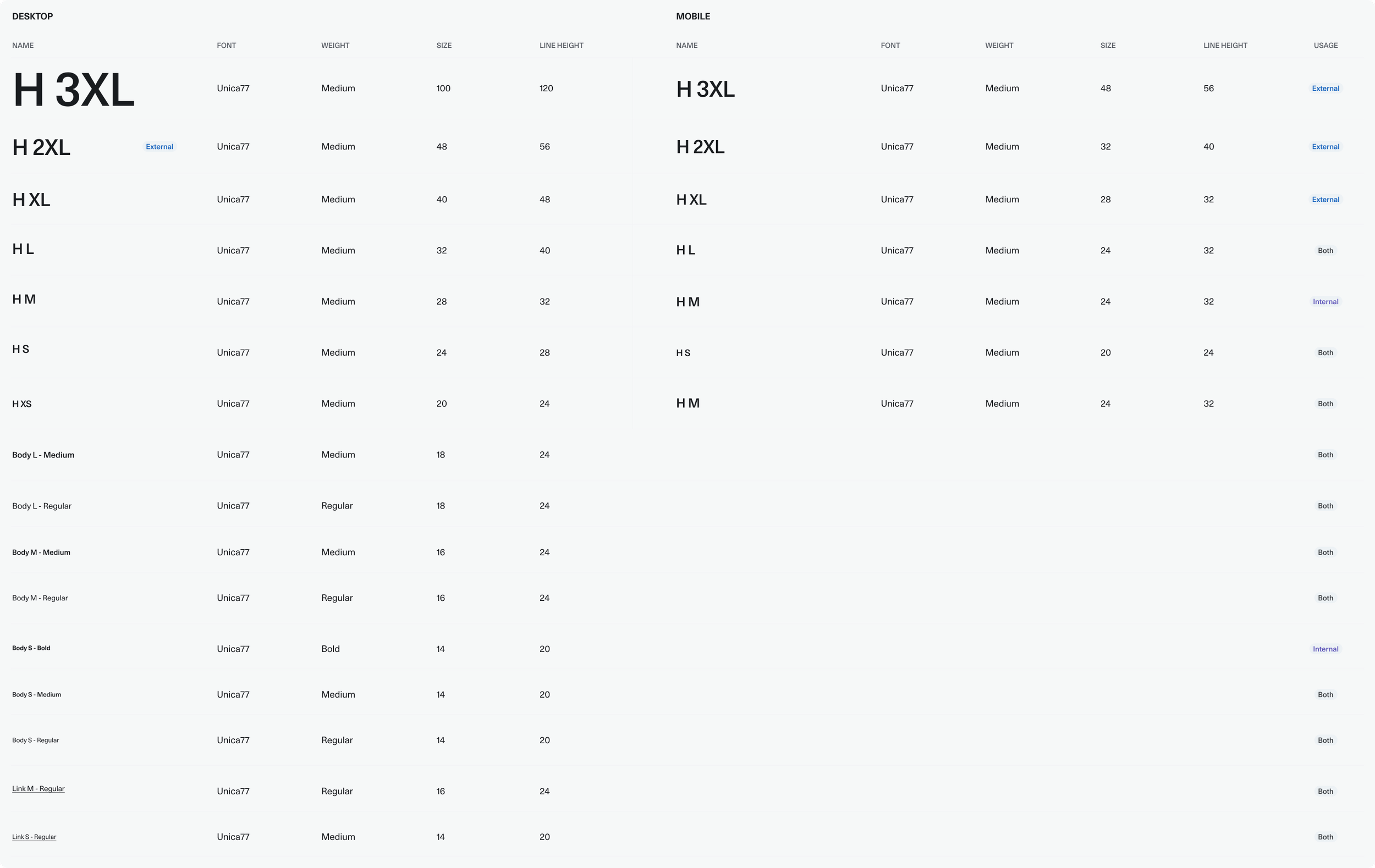
Typography
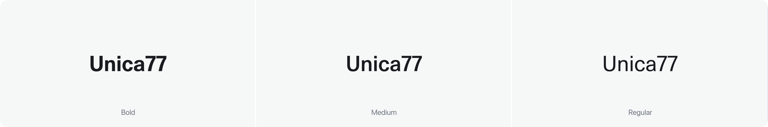
Previously, multiple fonts and text styles were used inconsistently across platforms. We streamlined typography by standardizing on Unica77 for all web products, both customer-facing and internal, to maintain brand consistency, especially since some internal tools are also visible to customers.
To reduce developer confusion with semantic headings, we replaced the H1–H6 naming convention with H 3XL–H S.
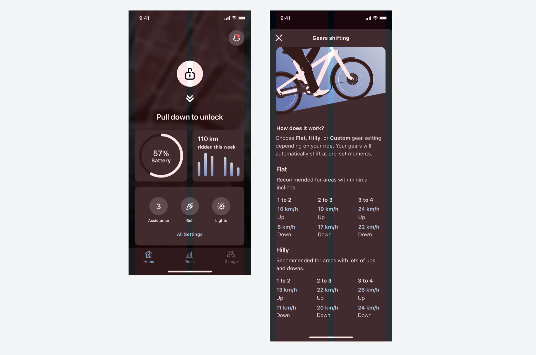
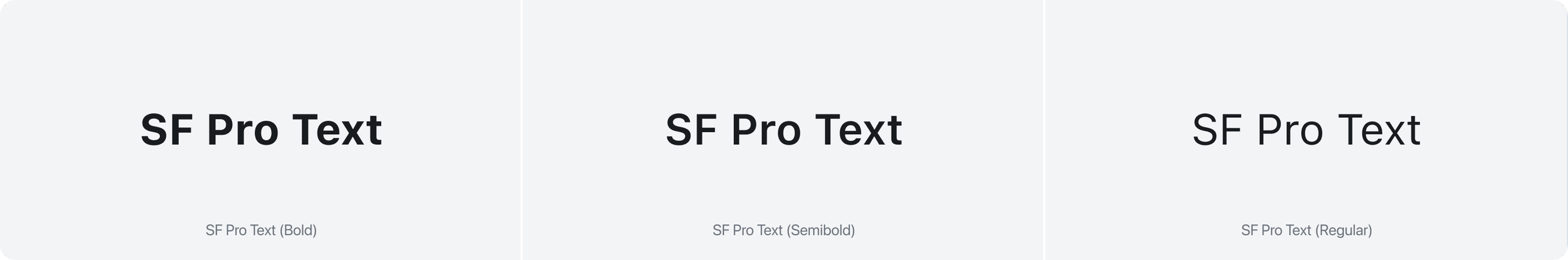
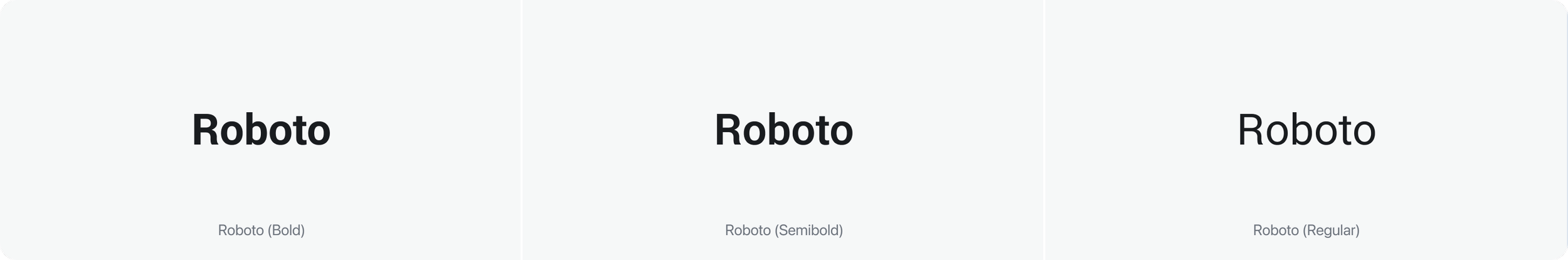
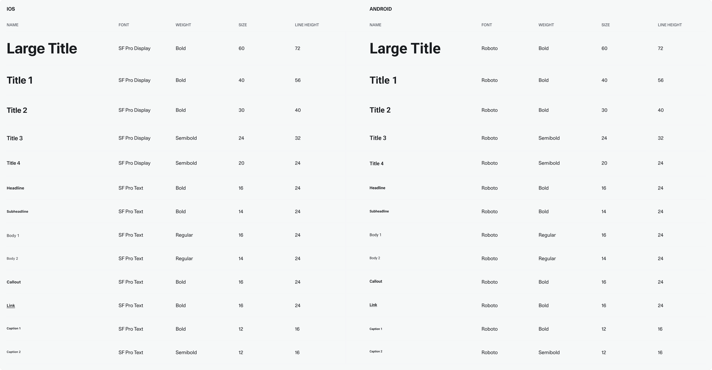
For native apps, we use the platform defaults, SF for iOS and Roboto for Android. While typography styles remained largely the same, we introduced clear usage guidelines to ensure consistent application, appropriate hierarchy, and accessibility across all products.
Web responsive
Native app
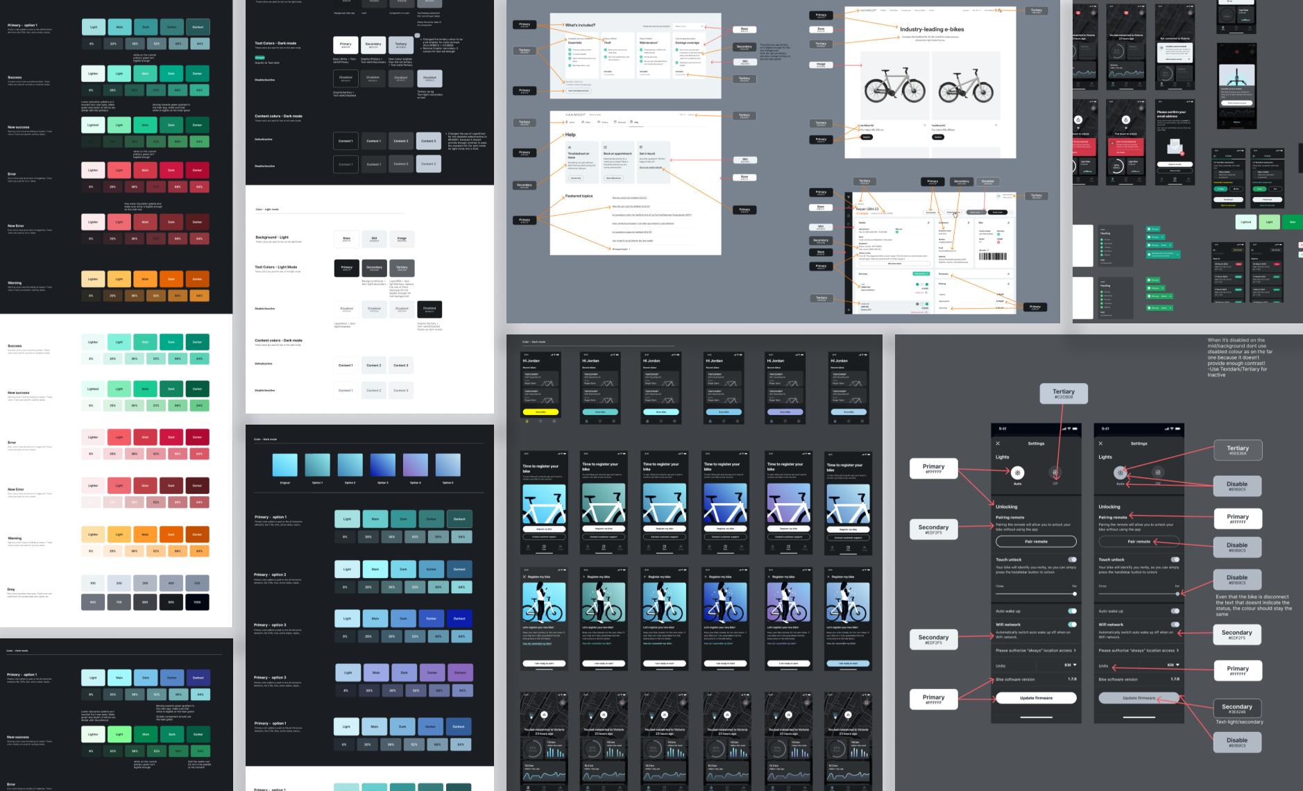
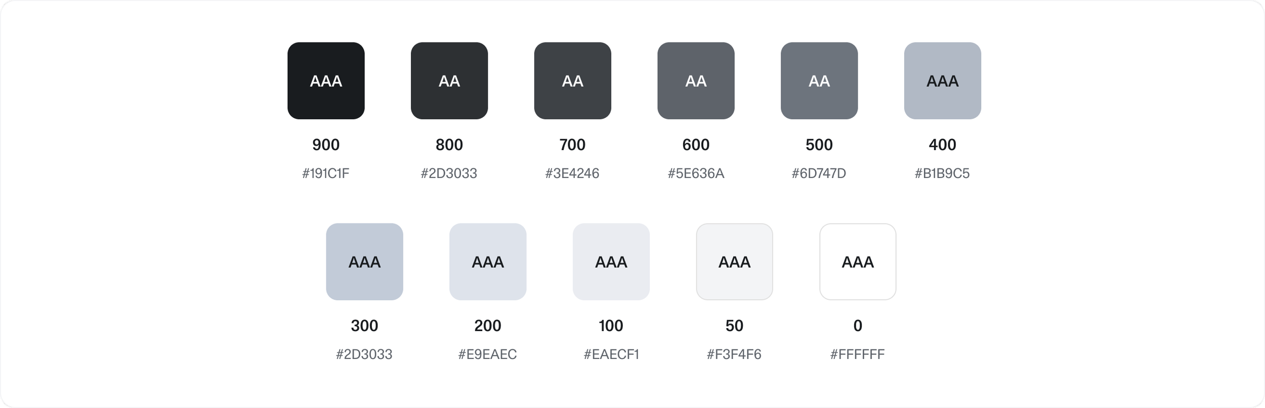
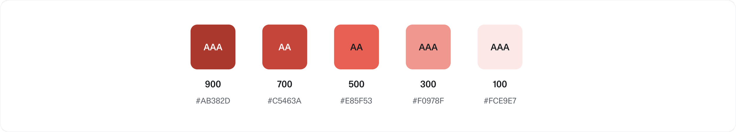
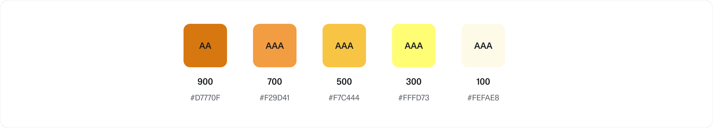
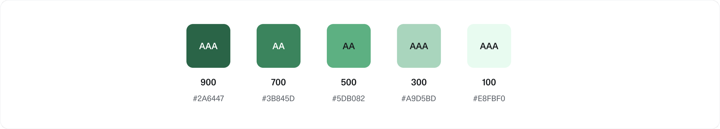
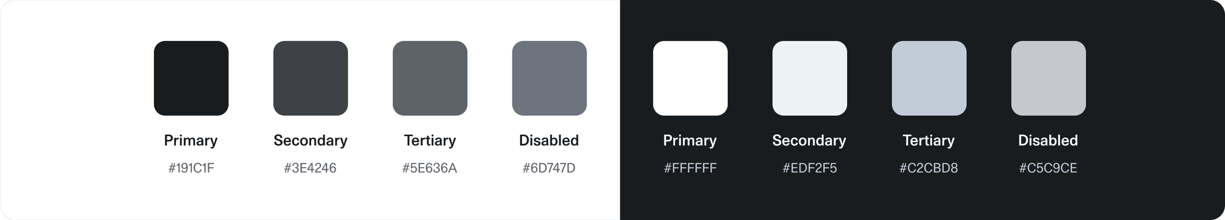
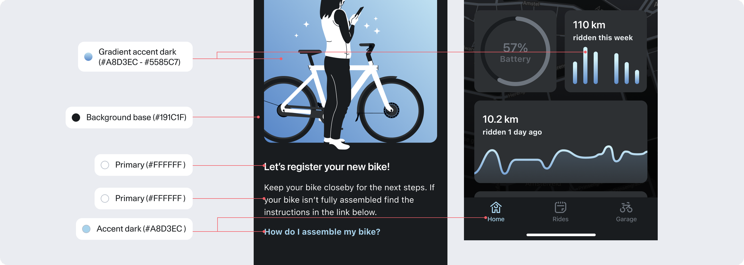
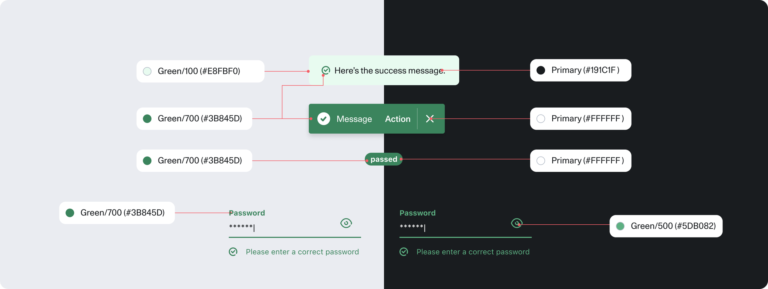
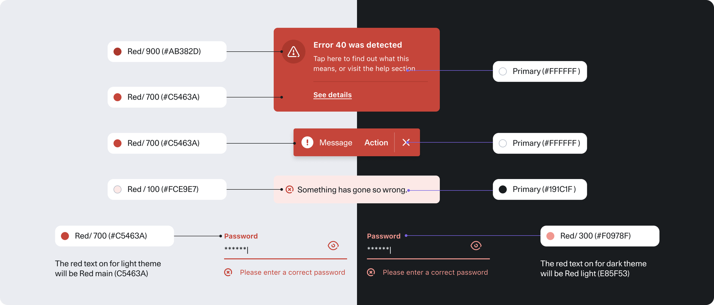
Colour
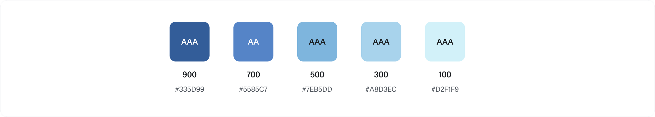
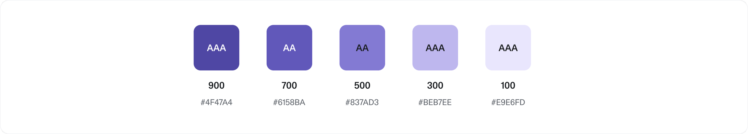
Accessibility was a major challenge in our existing products. Colors lacked sufficient contrast, and identical color usage was applied to both light and dark themes. A color that worked in light mode often failed in dark mode, while high-saturation colors in dark mode caused eye strain and reduced accessibility.
To address this, we redesigned the palette to meet WCAG AA contrast standards, creating distinct use cases for light and dark themes. Each color now has a clearly defined role and pairing, ensuring better visibility, easier navigation, and improved accessibility for users with color blindness or low vision.
We also strengthened the semantic use of color, making sure it communicates clearly, whether it’s indicating hierarchy, interactive states, or differentiating elements, so that color consistently supports content and user tasks.
greyscale
Color
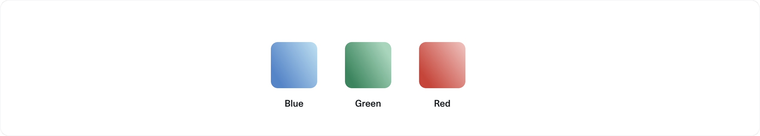
Gradient
Background layer
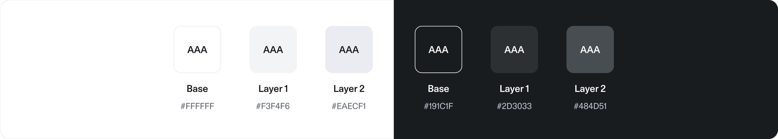
Text
Components
Theming affects the visual aspects of the Charge design language such as colors, shadows, and typography—while keeping component options and dimensions consistent across themes.
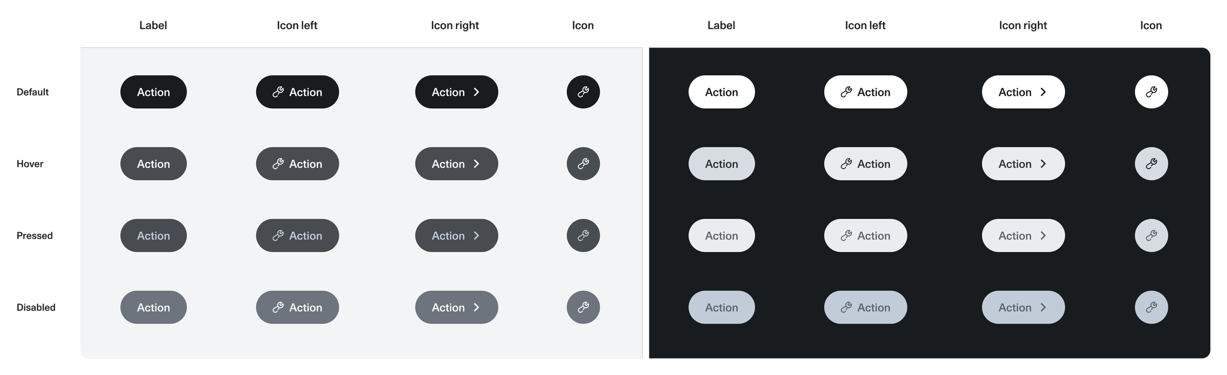
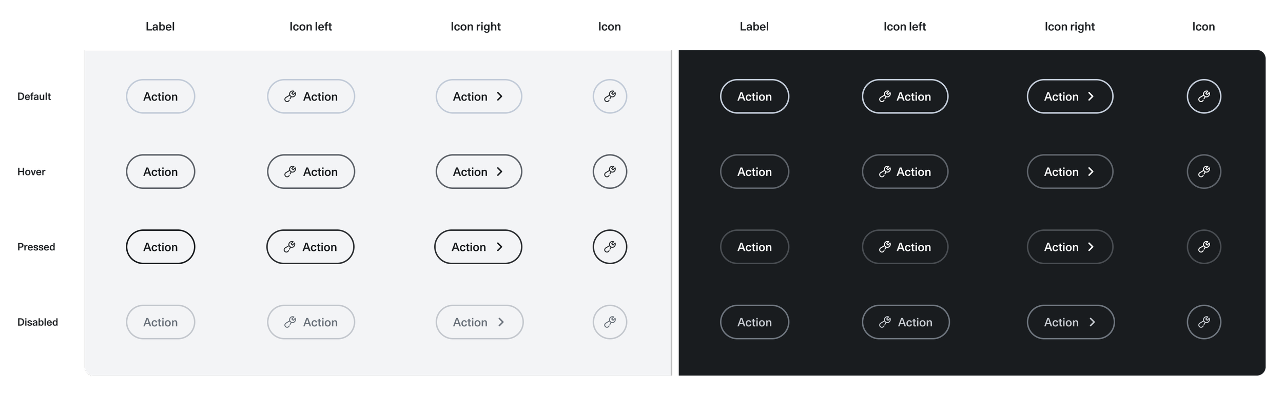
Buttons
Buttons are designed for both light and dark themes in three sizes; primary, secondary, and tertiary. In the native app, additional styles include round and list buttons. Each button supports multiple states (active, hover, pressed, focused, disabled, loading) and has an icon version available, ensuring flexibility and consistency across all platforms.
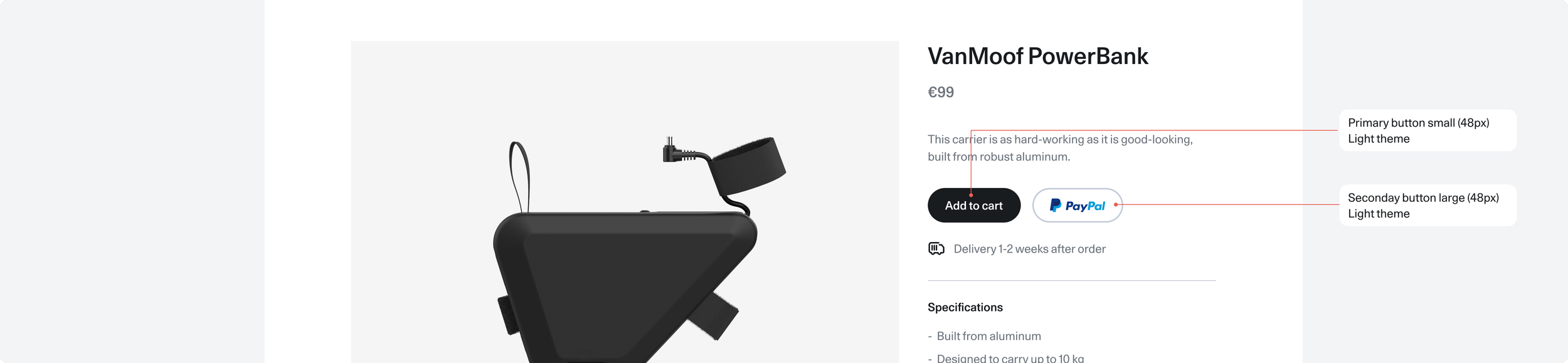
Primary button
Secondary button
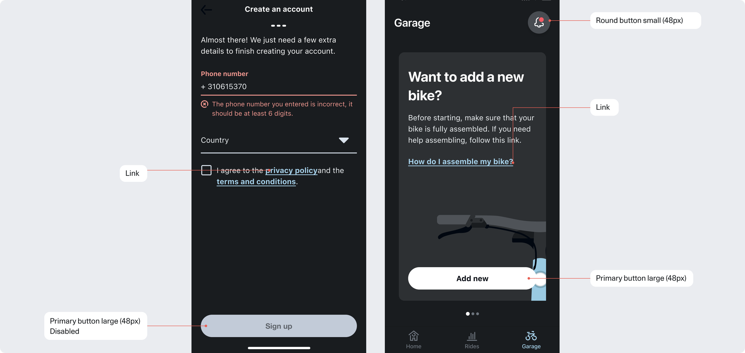
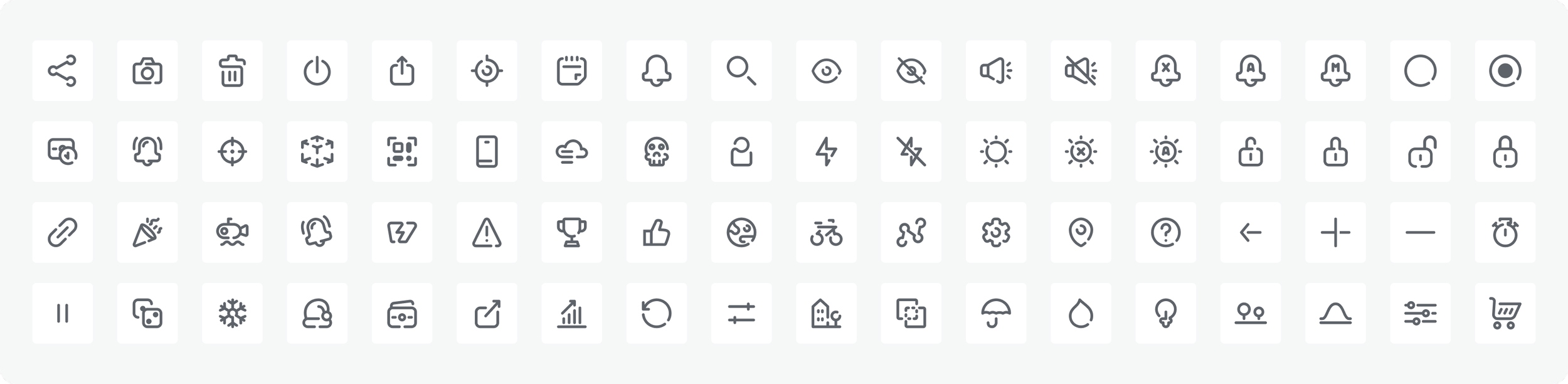
Icon
Icons act as visual cues, guiding users to understand and complete tasks efficiently. They can be used alone or alongside text for added clarity. Designed to reflect VanMoof’s brand personality, all icons follow a consistent outlined style with a 2pt stroke. They are available in three sizes; S (16px), M (24px), and L (32px) and, like buttons, support multiple states to ensure clarity and consistency across the interface.
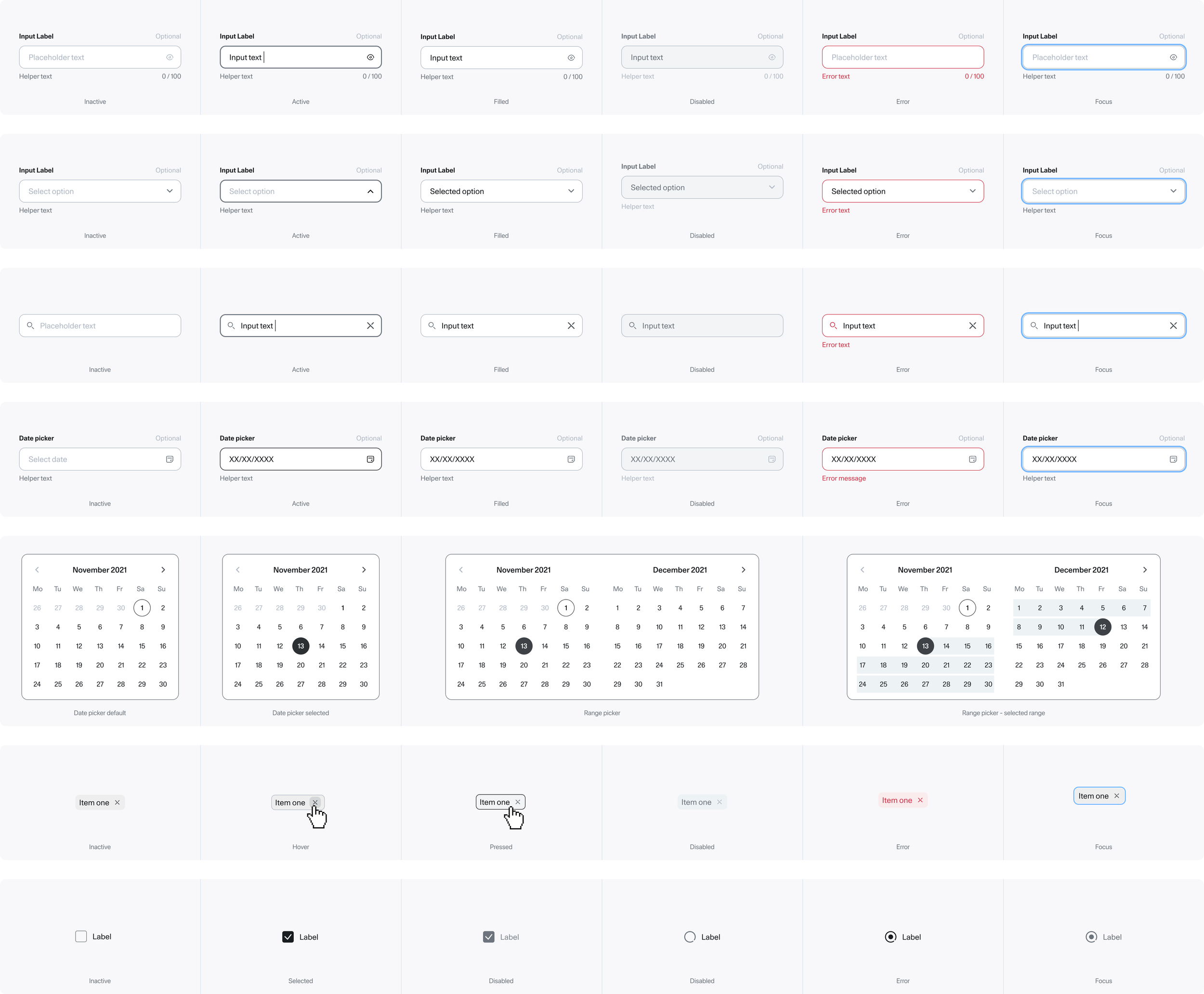
Forms
A form consists of a group of related fields and it accommodates several states. The fields include textfield, dropdown, search field, date picker, radio button and checkbox. Users must be able to read and access everything in both themes. The communication must be clear when something goes right or wrong.
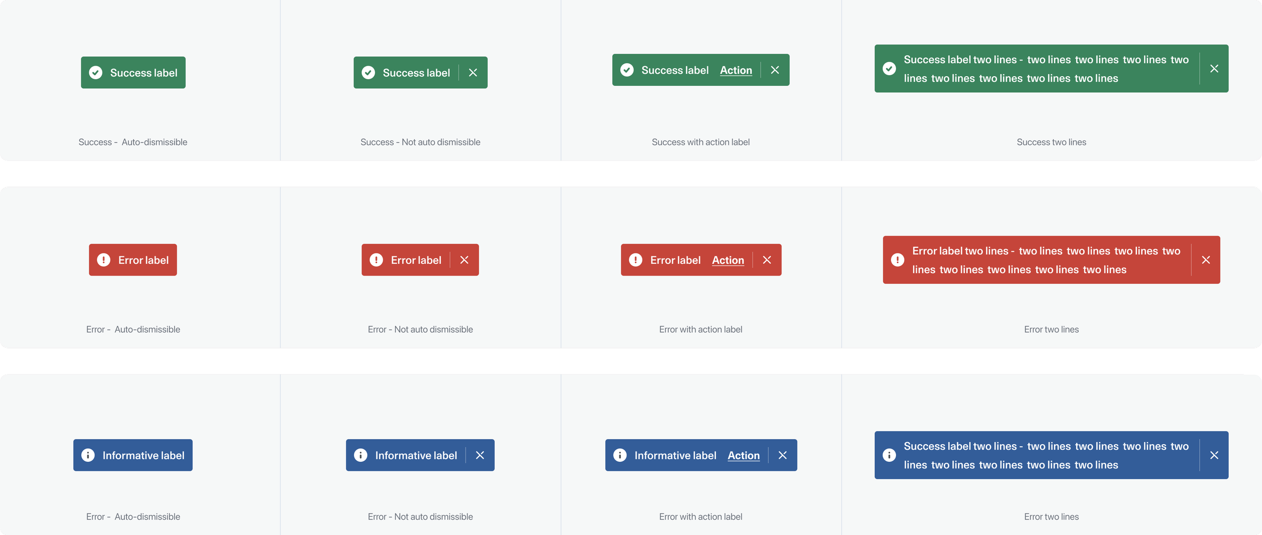
Toast
Toasts are another component that plays an important role in the system. They serve mainly as feedback from user action. They display brief, temporary notifications without disrupting a user's experience. When an action needs to be taken, the link will be presented on the right end of the component.
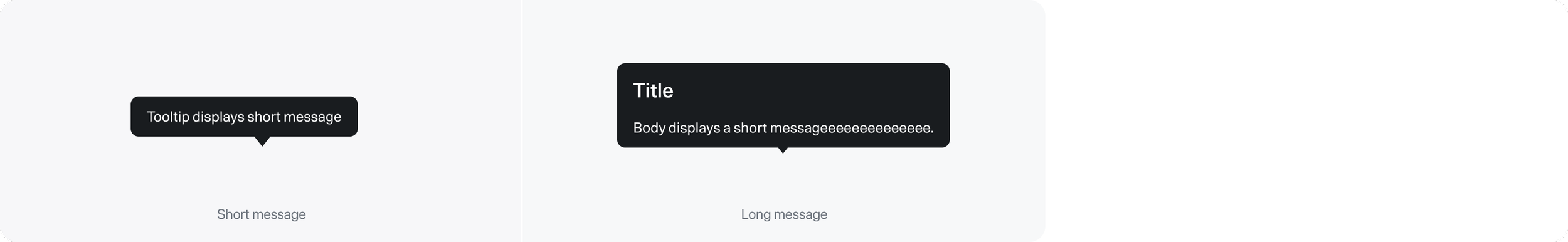
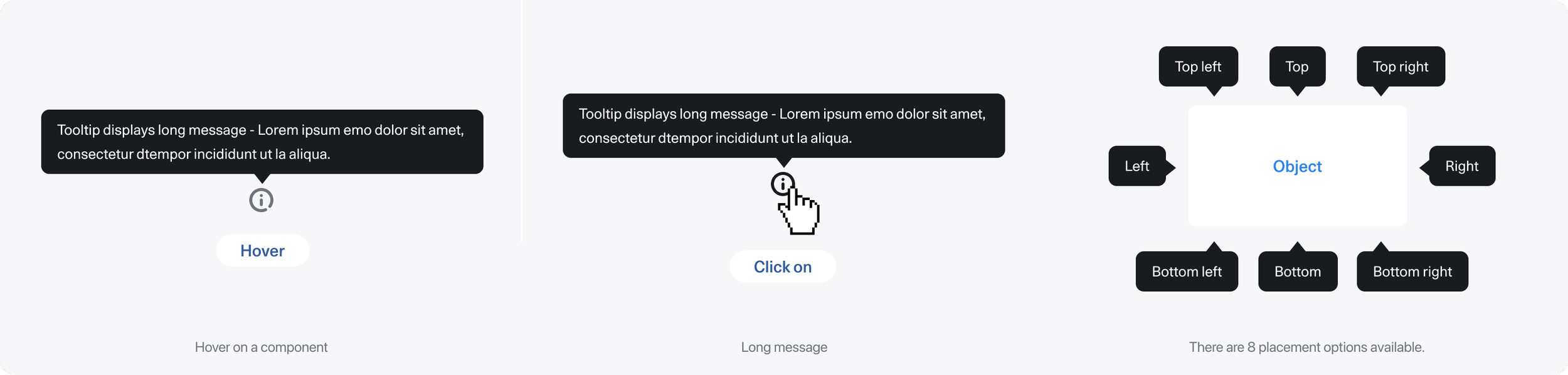
Tooltip
Molecules
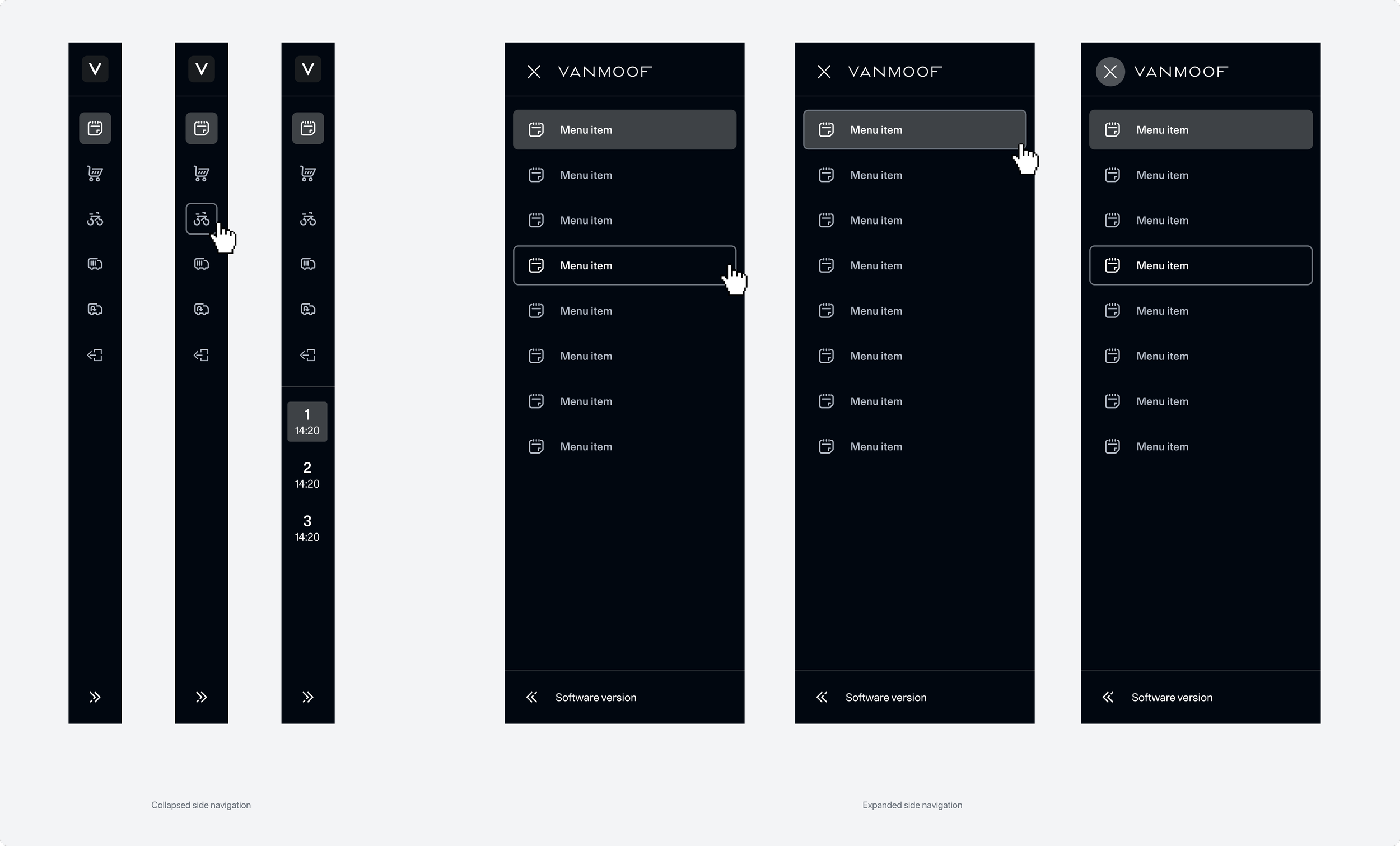
Side Menu
The side navigation can stay in two states, collapsed by default and expanded by choice. When collapsed, text will disappear and only icons will show. Clicking on an icon will navigate the user.
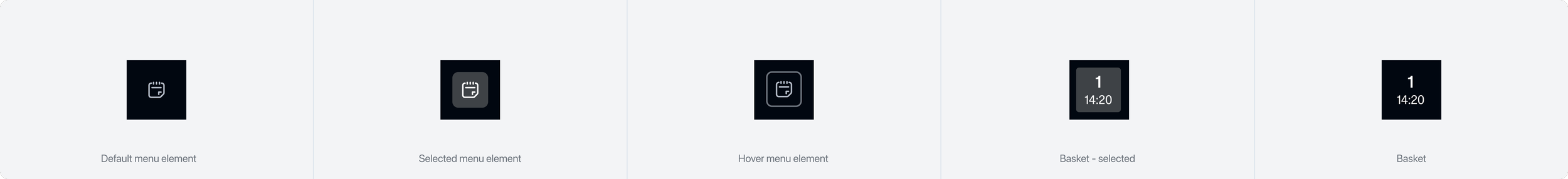
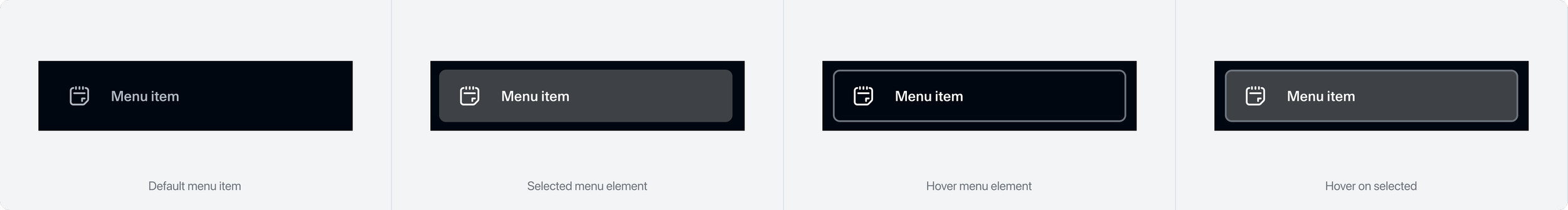
Side navigation
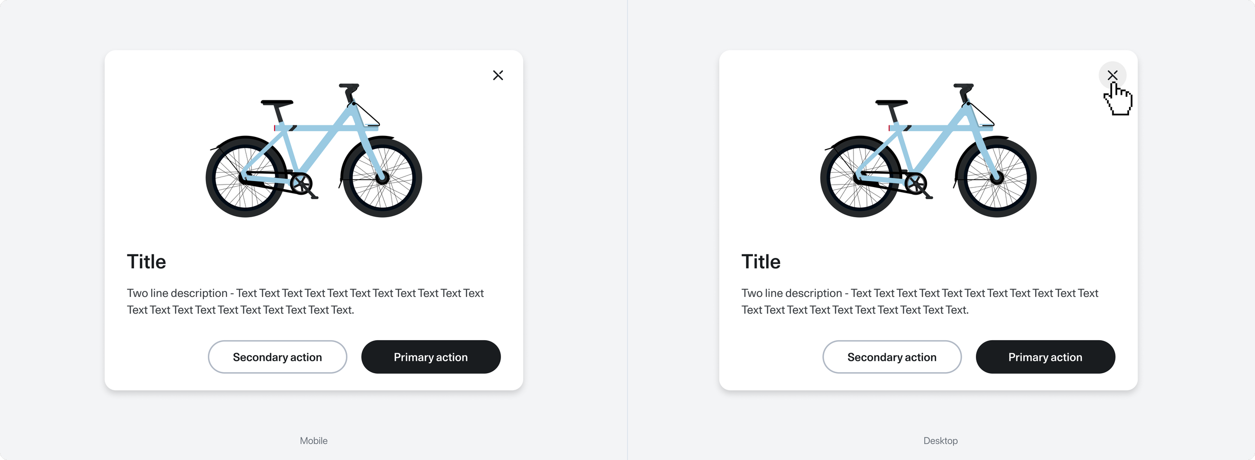
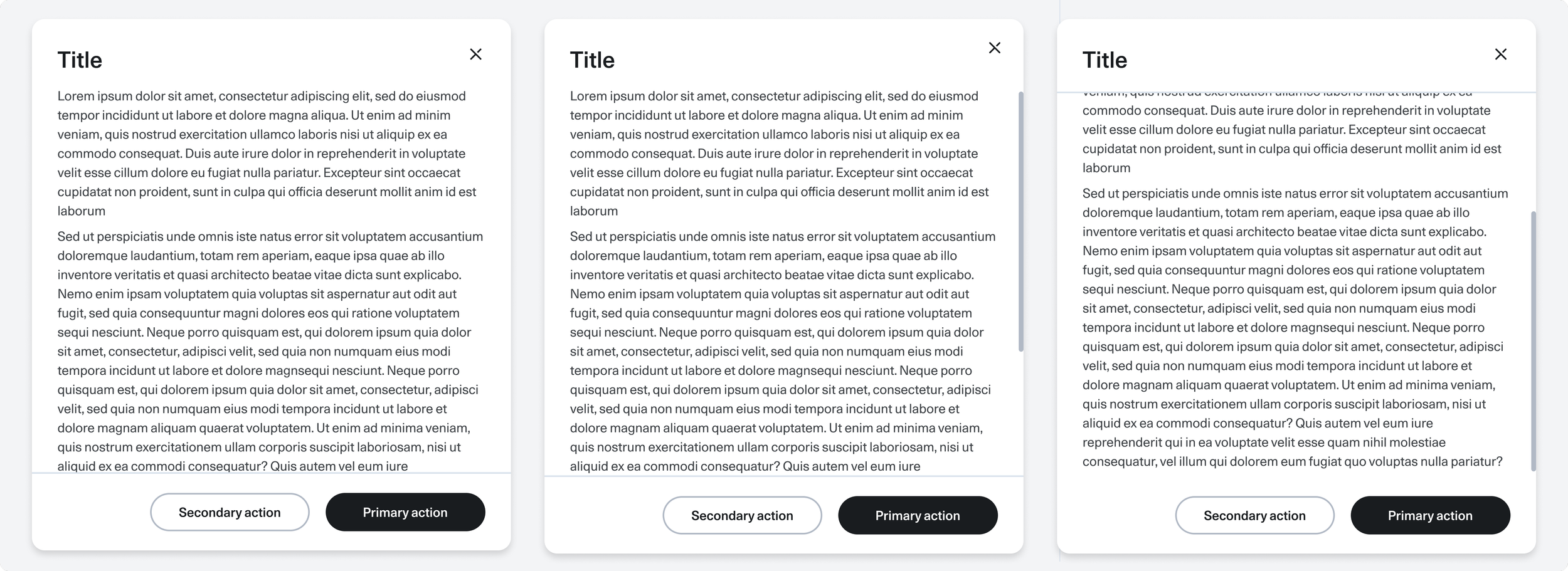
Modal
A modal is used to get user feedback, communicate, or display information. It is an overlay component, so the modal will be placed above the grid and have the fixed size. The size doesn’t change responsively with the grid. However, the size is different between desktop, tablet, and mobile devices.
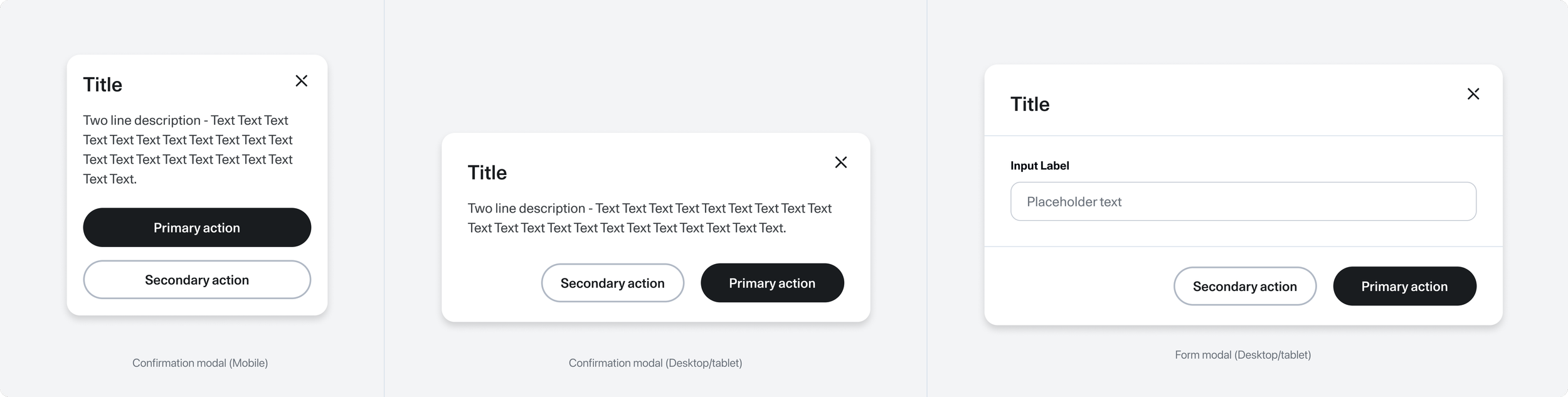
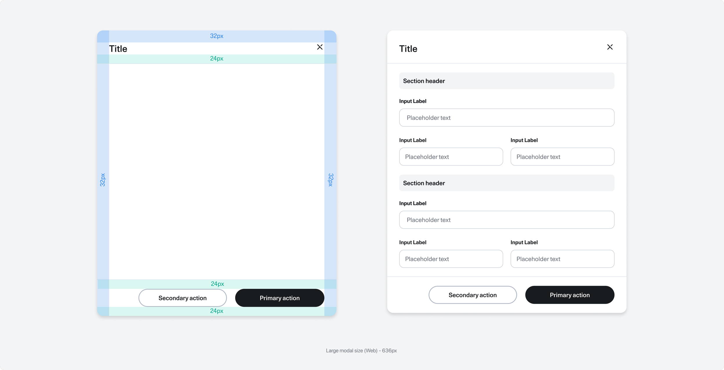
Scrolling behaviour
The modal’s height is determined by the content. Once it reaches a certain size, the body content will scroll while the header and footer remain fixed until the bottom of the modal dialog is reached.
Takeaways
Stakeholders management
A key lesson from this project was the value of early and ongoing stakeholder engagement. We identified key stakeholders from the start and kept them involved through guidance sessions, walkthroughs, and constant communication between design and development. Decisions were made collaboratively, with transparency ensuring everyone understood the “why” behind each choice.
Documentation
A design system is a living product; it evolves. To keep it effective, we documented every update clearly, outlining how and when to use each component. This made the system accessible to the whole company, strengthened collaboration, and streamlined onboarding for new team members.
Adoption
A design system only works if people use it. We began with the design team, then partnered with product owners to integrate changes into sprints so developers could gradually adopt the new styles.
The transition wasn’t instant; different teams moved at different speeds. But by tracking progress and using tools for reviews, we maintained quality and avoided inconsistencies. Starting with foundational elements, we worked toward a consistent design language and experience across all platforms.