

Online Shopping experience
Freelance UX/UI Designer, Dec 2018 - Feb 2019
ShopCart reimagines the shopping experience by seamlessly connecting offline and online retail. The app links stores, shoppers, and buyers, ensuring no one misses out on events and helping users secure products at the best possible price.
For buyers, sale events often mean battling crowds for limited deals, a frustrating experience many simply avoid. Shoppers, on the other hand, attend events or travel abroad to buy in-demand products and resell them for profit. But without an official platform, there’s no reliable way for the two sides to connect, leading to inefficiencies, missed opportunities, and a lack of trust.
Our goal was to create a credible, official platform for online purchasing—one that enables anyone to shop from anywhere, delivers personalized data for each user, and elevates the overall shopping experience.
My Role
As the sole freelance UX/UI designer, I partnered with the project manager and worked closely with the tech team in Bangkok. I led the entire design process from research to delivery covering:
User research & discovery
Interface design (web & mobile)
Prototyping
Usability testing
Process
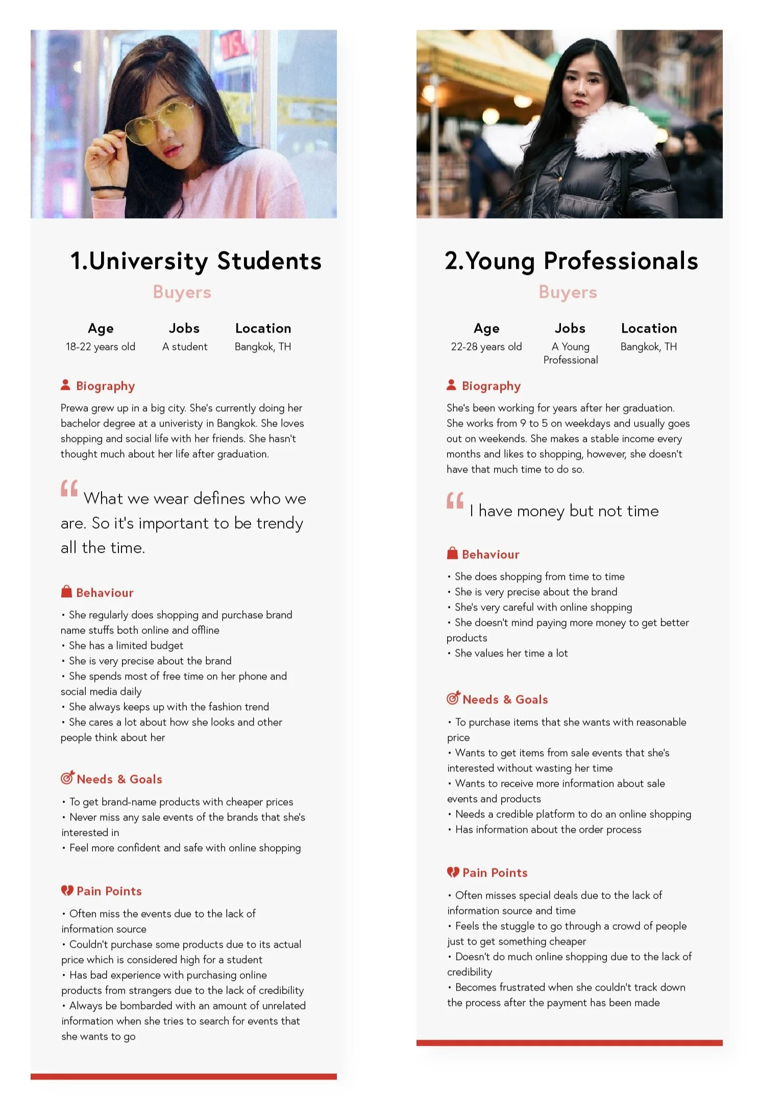
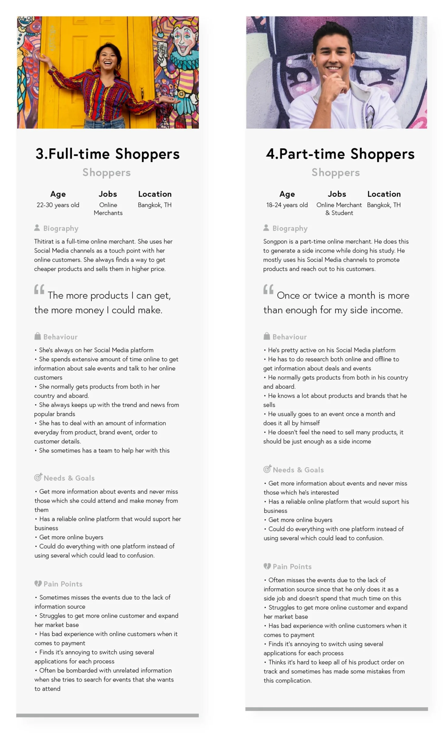
Research
From the data and interviews, I developed four personas representing the core behaviors, needs, and frustrations of our two user groups. These personas not only became the foundation for design decisions and participant recruitment for further testing but also revealed key pain points and actionable insights that directly shaped our solution.
Challenges
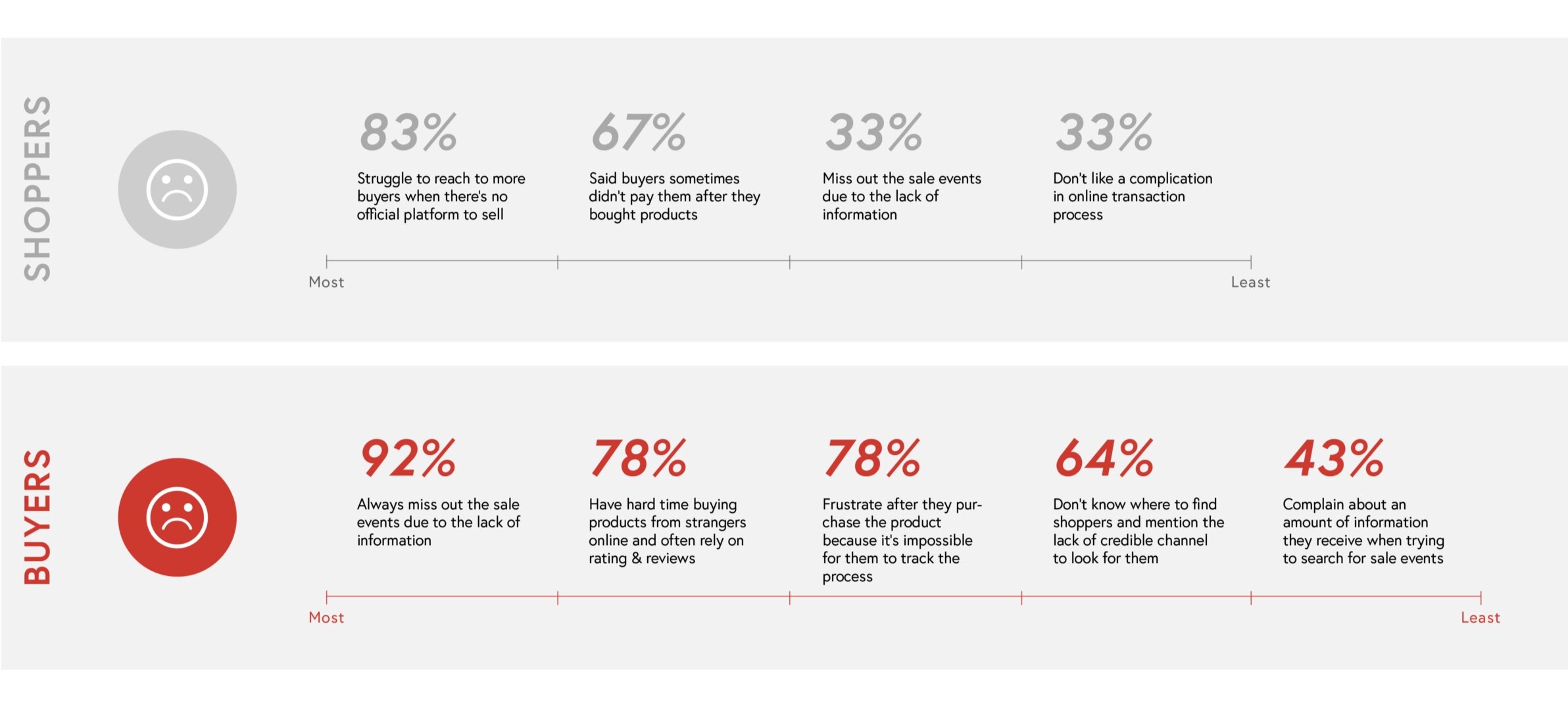
Event discovery is unreliable
Users often miss sale events or are overwhelmed with irrelevant promotions, making it difficult to discover opportunities that match their interests or location
Limited visibility into live availability
During live sale events, buyers had no real-time visibility into what shoppers were offering. This meant missed opportunities and frustration for buyers who were ready to purchase but couldn’t see product availability.
Fragmented transaction process
From chatting to purchasing to tracking an order, users had to jump between multiple apps and platforms. This fragmented experience slowed transactions and increased the chances of miscommunication or lost orders.
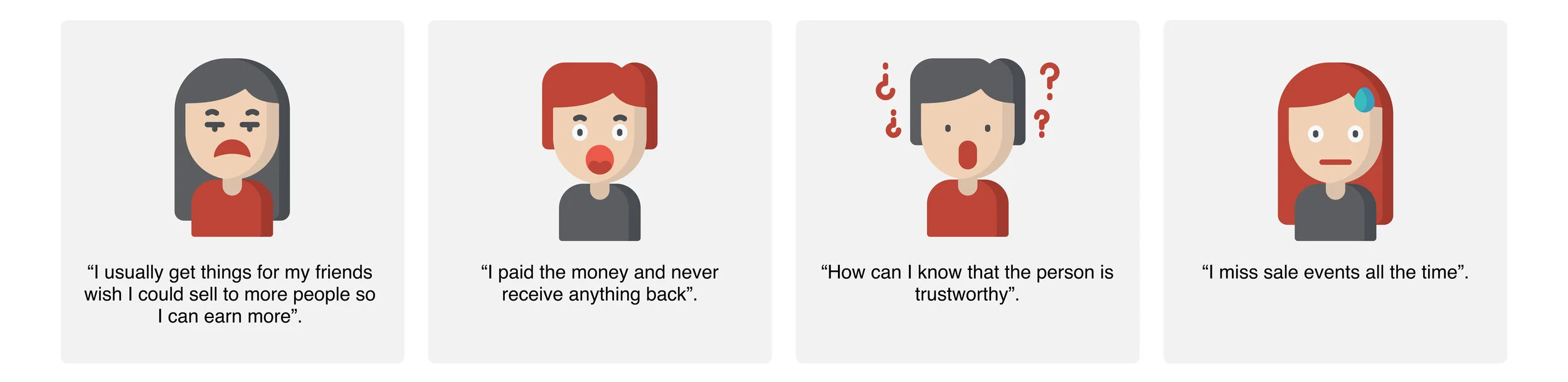
Lack of trust and transparency
Without live order tracking or credible ratings and reviews, buyers lacked the transparency they needed to feel confident. This uncertainty often led to hesitation, delays, or abandoning the purchase entirely.
Buyer’s Flow

Shopper’s Flow
Solutions
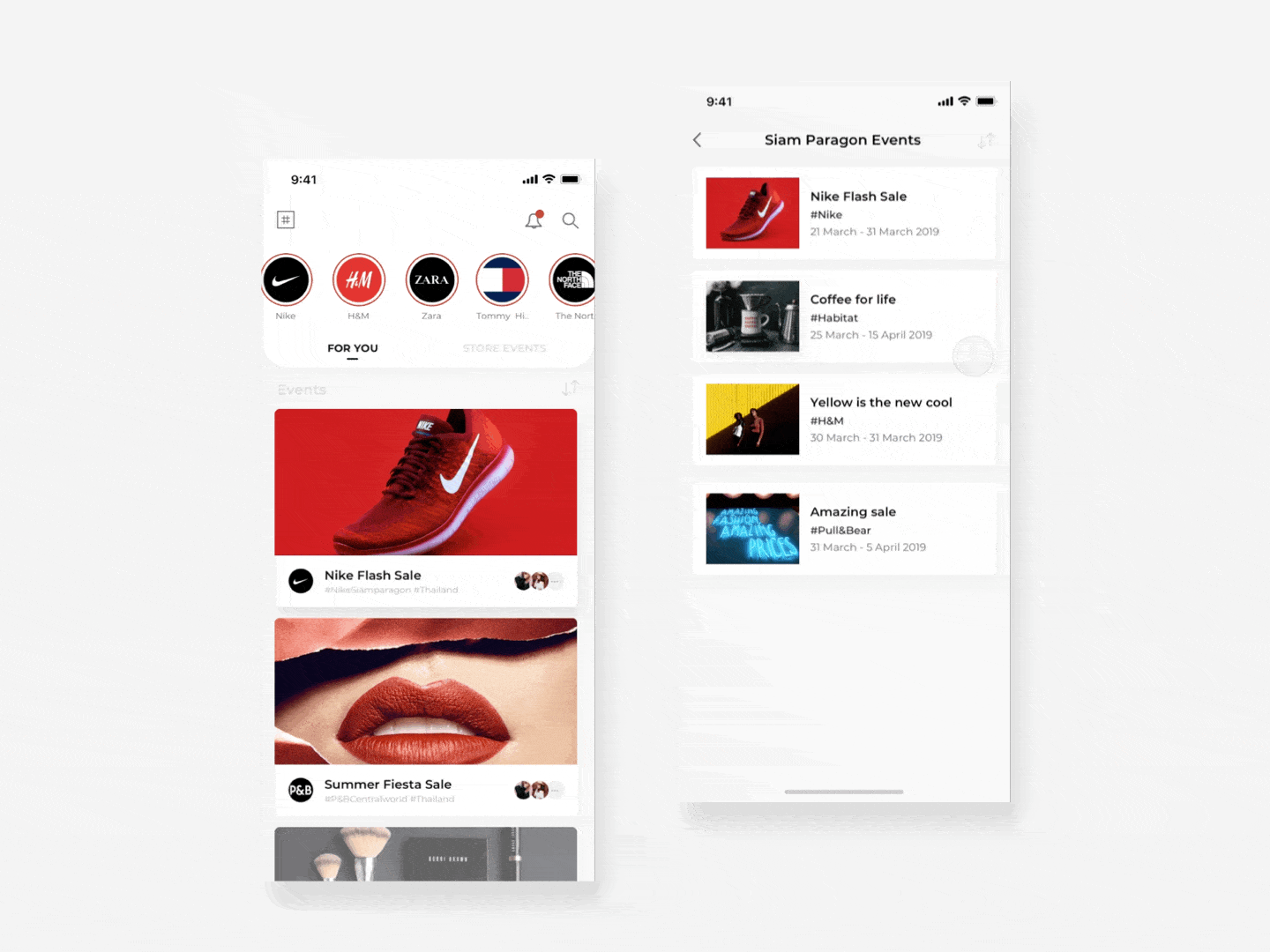
Discover events
Ongoing events are personalized to each user’s preferences, ensuring they never miss opportunities or get overwhelmed with irrelevant information. For shoppers, events are grouped by preference and store location, with the option to browse international events and feeds from travelers abroad, making it possible to purchase items from anywhere, anytime.
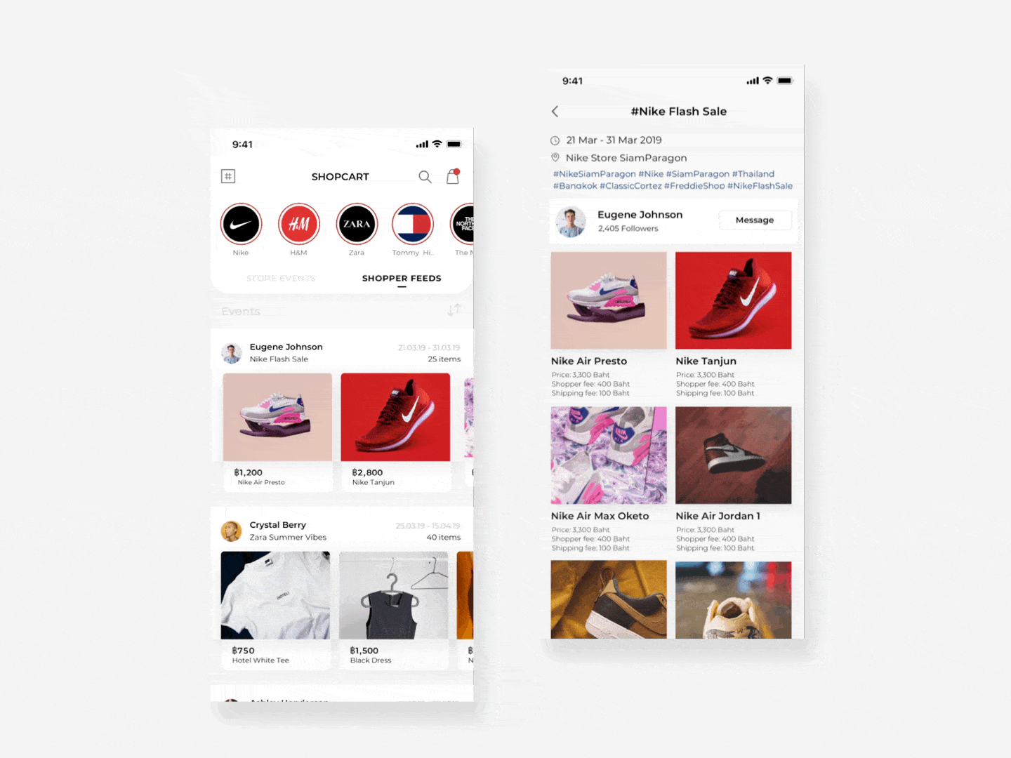
Shopper feeds and stores
Buyers can view both store events and temporary shopper feeds, created when shoppers attend events. Shopper feeds showcase available products and prices in real time, while store events display event details and locations. Buyers can choose to attend in person or purchase directly from shoppers.
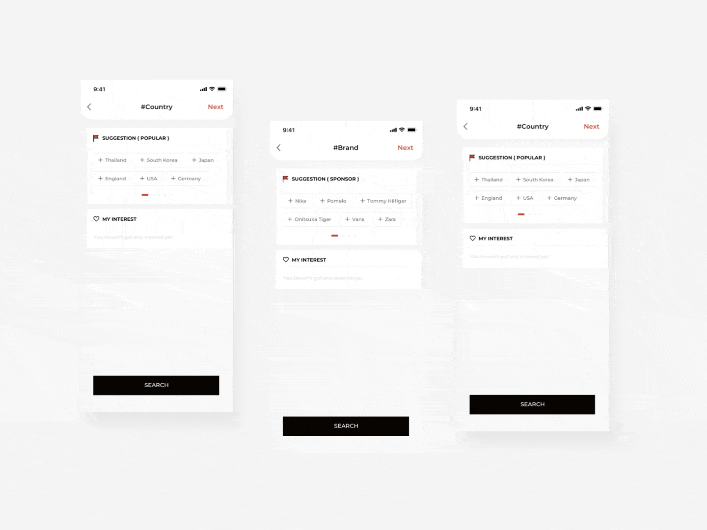
Hashtag Setting
The app organizes all content using hashtags, powering both search and personalized recommendations. Users set their product, brand, and location preferences during onboarding, which the system uses to display only relevant information. Preferences can be updated anytime for a tailored experience.
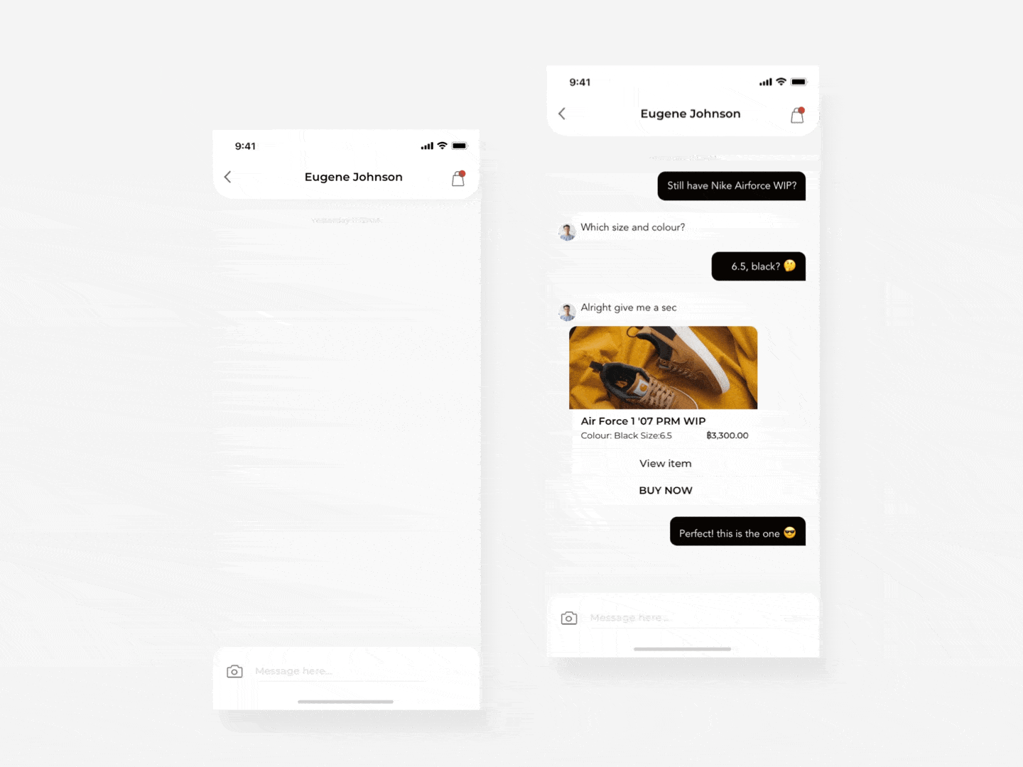
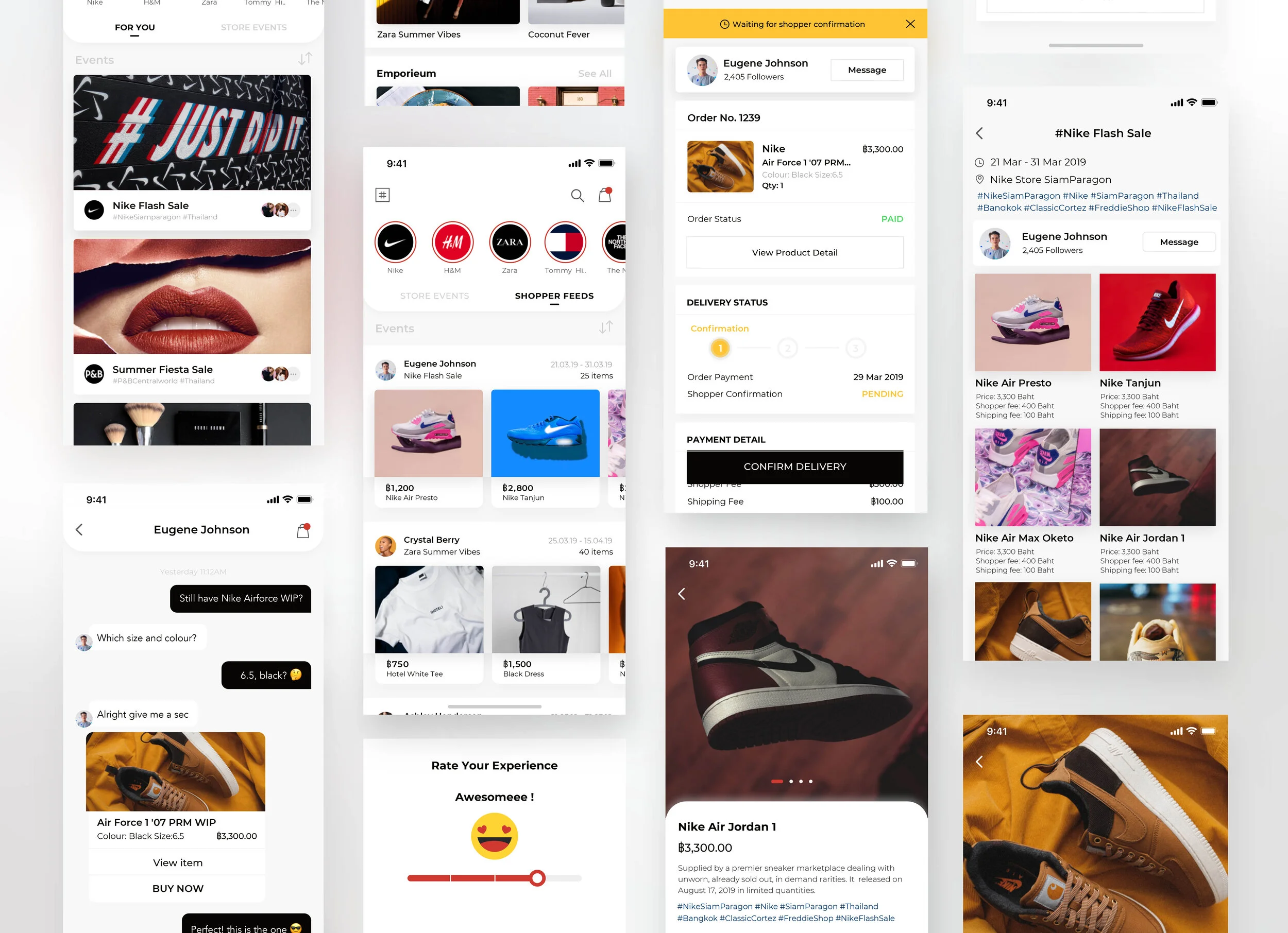
E-Chatroom
The e-commerce chatroom is the central hub for all transactions. Buyers can communicate with shoppers, view products, make purchases, and track orders. Everything is all in one place, eliminating the need to switch between multiple apps.
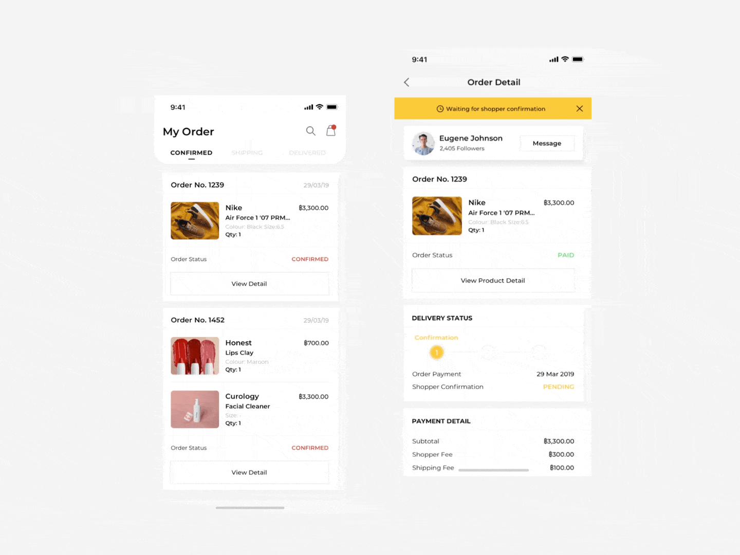
Order Tracking
Both buyers and shoppers can view live updates and track every step of the order process, with notifications sent whenever the status changes.
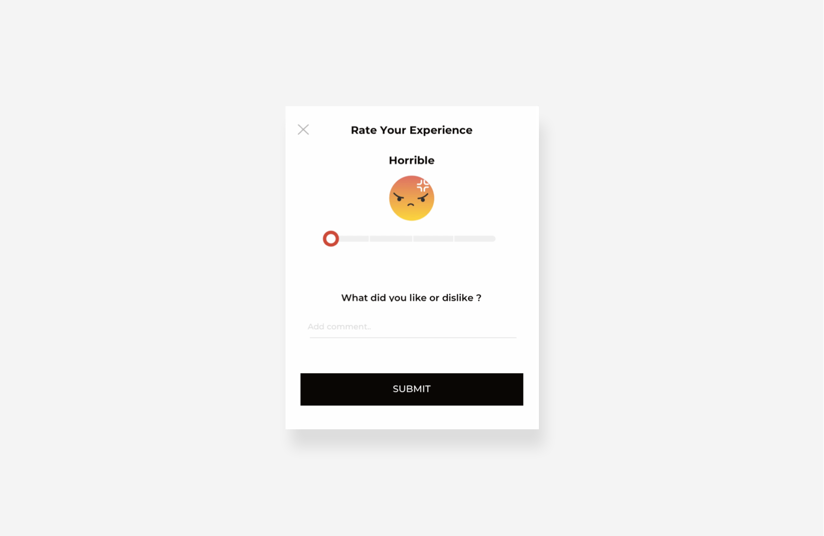
Rating & Review
Ratings and reviews build trust by helping buyers make confident purchase decisions. Feedback is visible on each shopper’s profile, and buyers can leave reviews once an order is complete.
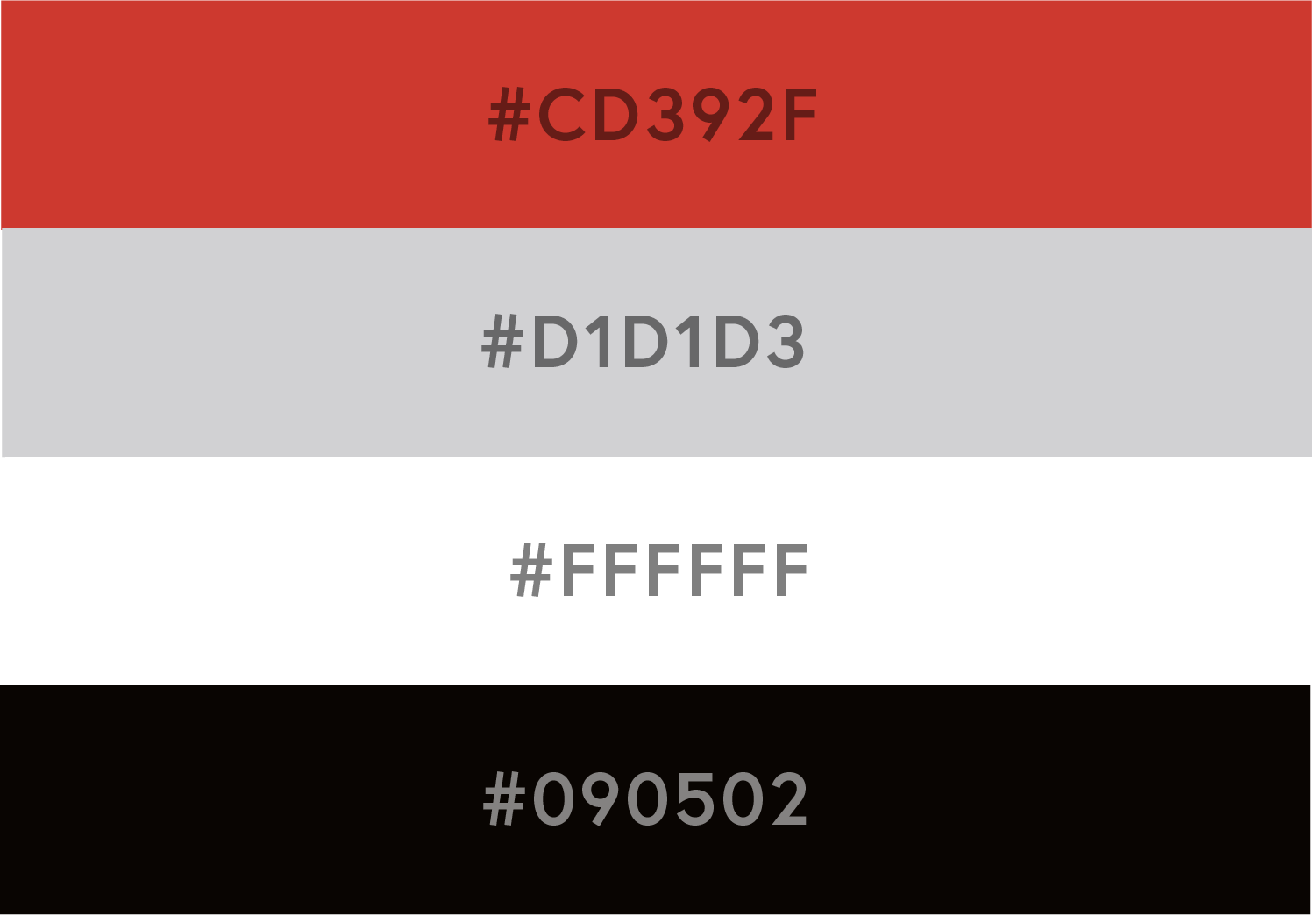
Colors
While keeping the design minimal and clean in black and white, I used red strategically to highlight key elements, spark desire, and motivate purchases. Generous white space reduces eye strain and keeps the focus on product photos without competing colors.

Typography
I chose Montserrat for its geometric, clean, and modern look. Most text is set in black, with hierarchy created by reducing the opacity for less important information.